Sunday, July 1, 2012

"Peonies"

Sold
"Peonies"
8 x 10 in
Oil on Canvas Panel.

I've been away from painting these small gems for a while now as you may have noticed.  I have been swamped with work that needed all of my attention, I finally was able to finish half of the commissions I needed to.  I miss doing these daily's for many reasons but I know I have to get more of my personal work going rather than concentrating all of my efforts in these studies.  It is passed the season of peonies but I was able to get some off the farmers market, they were not as fresh and lively looking as I wanted them to be but they still possessed beauty.  The process of creating this painting is similar to the other alla prima's.  Each peony I handled as a sphere only concentrating how the light wraps around the form, not worrying about details yet just how light skims across the form.  At the beginning stage when modeling the lights I do not put in the highest keys in values and the darkest values.  Once this stage is complete i'm able to complete the painting by just adding the smaller forms or details to each "sphere". 

I also wanted to give you guys some news in my personal life, I just got engaged about a month ago and have been on cloud nine since.  I met my beautiful fiancee in Florence, Italy when I was studying at the Angel Academy of Art.  She was studying for a semester through the University of Minnesota.  By chance we met and I fell in love at first sight.  I moved to Minneapolis to be with her and haven't looked back since.  You can read a snippet about it on her blog.  To say I am the luckiest guy in this world is a major understatement, I am beyond blessed to have found my beautiful fiancee.

Thanks for stopping by I hope you enjoyed this one!  

Saturday, May 19, 2012

"Bacchante & Satyr"

"Bacchante & Satyr"
9 x 6 in
Ball Point Pen

This is a ball point pen drawing I've been working for a while now, its from the collection of the M.I.A.  I usually don't draw multi-figures with ball point pen but loved the challenge of it, especially since I wanted to capture the texture from the marble with ink.  The draw back is that I did not have enough space on my paper to get the right side of the satyr's thigh, but that is the price I pay for drawing directly on with ink without any preparation.  With all my ball point pen drawings that's how I start with light short lines indicating where shapes will be placed.  I'm working on another piece right now and taking process photos, I've been getting a lot of questions on my process with these ball point pen drawings and hope with the process photos you can get a better idea of how I execute them.  Thanks for stopping by and viewing! 

If you notice the yellow tint on the right side of the drawing, that's oils from my hand another lesson to put something between your hand and the drawing.

Monday, May 7, 2012

"Yellow Ranunculus"

Sold
"Yellow Ranunculus"
10 x 8 in
Oil on Canvas Panel


Wednesday, May 2, 2012

"Beach Memories"

"Beach Memories"
6 x 6 in
Oil on Canvas Panel

Have been out of the loop for a bit but have been really busy with other projects which I hope to share with you guys soon.  Hope you enjoy my new alla prima!

Wednesday, April 18, 2012

"Green Vase"

Sold
"Green Vase"
6 x 6 in 
Oil on Canvas Panel
Today I saw this vase around the house and saw how much I liked the way it looks on these wooden panels.  There's no particular explanation why I chose to paint this just the sole purpose of getting inspired by what I saw at that moment.  It's great being able to pick up the brush and just paint what you see, I was not planning to paint today but I did see this vase and how the light was hitting it and just had to.  There's beauty in everything we see I know it sounds cheesy but its very true, it can be the most mundane thing and it still has some beauty to it.  It just matters how one perceives what he or she is looking at.  
I started with the usual dry brush approach of using just a bit of raw umber on the brush for the drawing stage.  After the drawing stage I stated the local color in the vase by using viridian, cadmium yellow and raw umber.  When stating the general colors I am also stating the big form modeling, i'm not stating the extreme values of the darkest and lightest values just a close approximation to get a base down.  The extreme shifts of values I leave towards the end of smaller form modeling.
Then I start stating the middle to darker value within the vase, this is where I start stating the darkest values to get the point across that the form is turning.  Then I state the lighter values with their specific forms, this stage I also state the highest value or highlight to tie it together. 
After the vase is done I moved on to the background and stated the base and background together.  I used ultramarine blue, raw umber, naples yellow and titanium white for both.  I hope you enjoyed this simple and quick painting, thanks for stopping by and viewing.


Monday, April 16, 2012

"Ranunculus"

Sold
"Ranunculus"
8 x 10 in 
Oil on Canvas Panel
I haven't painted flowers in a while and wanted to paint these, I gave these ranunculus to my girlfriend and decided after a couple days that I needed to paint their beauty.  I've been busy painting larger paintings and producing ball point pen drawings so it was nice to change the pace to these alla prima's.  After not painting alla prima's for a while it was tough to get started and find a rhythm, after half way through it started to click and come back to me.  I really do miss painting these guys on a daily basis but at the same time I like devoting most of my time to my larger more personal work.  The sole purpose of these alla prima paintings is for practice and try to understand the oils as best as I can.  Painting flowers are a bit different than painting a regular object in a still life, first flowers move by the hour and second their form is far more intricate and complicated.  I found painting flowers you have to simplify their shape as much as you can and towards the end of the painting stages thats where you can get complicated with the rendering.  Overall it's a joy and pleasure to paint a beautiful subject matter as this.
I started with the usual dry brush approach by just applying a bit of raw umber on the brush and using no mediums.  When the drawing is completed I then stated the background and after the general statement of the flowers and vase.  At this stage I just lay in a thin layer of paint which creates a nice surface for the oils in the later stages.  I am also concerned of the movement of light at this stage, big form modeling if you will.  I used ultramarine blue, naples yellow and titanium white for the background.  For the roses I mainly used quinacridone magenta for the initial stages, and for the leaves and vase I used viridian and naples yellow.  I usually don't lay out my colors all at once because I like the keep the paints fresh in every section I work in, I do know with certain colors you are able to get away with that instead of having a dry look towards the end of the painting.
Once the big form modeling was complete I then started to just concentrate on individual sections, I choose the first left roses to paint.  First I stated the darker values with their specific shapes, the colors I used were quinacridone magenta and ultramarine blue for the darker values.  Once the darker shapes were complete I moved on to the lighter shapes and stated their specific forms.  I used titanium white mixed with quinacridone magenta for the highlights and lighter values.  I repeated the same process with the middle set of flowers
As you can see its the same process when stating the lighter values after the darks are complete.  It usually flows nicely when you complete each stage well,  there are at times were you do have to go back and adjust certain things to get the overall value or paint quality right, just depends on how the look of the object your painting.  I repeated the same process with the third set of flowers on the right side of the painting.
Once the flowers are complete I moved onto the vase and stating the middle to darker values, the colors I used for this stage were viridian, and ultramarine blue.  This area is a good lesson in not painting every hair on a dog to get the point across that theirs a lot going on, as long as you paint a representation of the form and whats going then your find getting away with it.  If I was to paint every single strand of stem and leaf then it would start to come out bland.  You have to choose your battle and see what information is important to leave in their when you paint, what will help you'r painting out if you were to leave that out or push it more in order to get the message across.  Remember your the director of this frame you can choose what the viewer see's and feels.
I finished the painting by stating the small stems poking out of the flowers.  I hope you guys enjoyed this one, I know I did and hope to do more in the near future.  Thanks for stopping by and viewing!


Wednesday, April 4, 2012

"The Butcher"

Contact me if interested in purchasing
"The Butcher"
7 x 5 in
Ball Point Pen

This portrait is of our local butcher that I have been wanting to draw for quit some time now.  I stopped him one day and finally had the courage to ask him to pose for me, to my delight he agreed.  I enjoyed drawing this portrait for many reasons, one of which is that I know this person but at the same time I really don't know him that well.  To try to capture him through the drawing was a challenge in that aspect, but since seeing him so much at the store I feel like I got a good idea of his personality.  I wanted to keep the background blank to frame the portrait and have all the contrast in the center.  To say I enjoyed this drawing is an understatement I hope to do more of these in the near future.  Thanks for stopping by hope you enjoyed! 

Monday, March 26, 2012

"Mixed Tomatoes II"

Sold
"Mixed Tomatoes II"
8 x 10 in 
Oil on Canvas Panel
I wanted to continue the play on colors with these delicious tomatoes, I especially wanted to have an array of colors with an interesting composition.  The textures in their skin is extremely subtle along with their color shifts.  I felt for the most part I was painting mini balloons, never painted balloons before and now have an idea on how to do so.  With this painting I wanted to revisit big form modeling and implore that idea further.  I've stressed in previous posts about the importance of big form modeling and with this posting I'll do the same.  Playing with so many elements at once is challenging but delightful after seeing its completion from start to finish.
I started with the usual dry brush approach using no mediums and a bit of raw umber on the brush.  Once the drawing is complete I state the general colors of the tomatoes all at once, I do this to get unity out of the group of, this also lets me create a base to move my paint around and have that unity from beginning to end.  In this stage I am not concerned with big form modeling or details just the general flat color of the area.  The colors I use for this section are cad.red, cad.orange, cad.yellow medium hue.
After the general stage is complete I then start on big form modeling, this stage I start adding different colors that help turn the form with its light.  Still not worried about "details" or small form modeling just on how the form is turning away and into the light.  It's important to state that this stage is crucial in order to have a successful completion to your later stages.  I also stated the background in this stage to tackle the edges further.  Big form modeling is essentially laying down all the ground work for you, the smaller forms later or the "details" will lay in perfectly if the big form is done right.  With big form modeling I don't lay in the highest highlight or darkest value just a middle of the two to get the form turning.  Then on the next frame you can see that I laid in the smaller forms with the darker values and lighter values.  I like to break them up into two sections starting with darker then lighter values.  These sections work just right with the big form modeling, of course there is some areas that need fine tuning in order for the smaller form model to work right, but for the most part big form modeling lay's out the blueprint for each section you'r painting.
Once the tomatoes are complete I then start on the wooden base by approaching it the same way as I did with the wooden base.  First laying in the general colors and then doing the big form modeling or a fall light across the board.  Again not worried about the grainy textures in the wood just on the general light moving across the form.  This stage I am not applying the lightest or darkest values, I get close but stop since I add those details with the finishing touches.  Then on the next frame I state the smaller forms by first applying the darker values with their specific forms.  For this stage I used primarily burnt umber, raw umber titanium white, naples yellow and cerulean blue.
Once the darker forms are complete I state the lighter forms and take the wooden board to a finish.  I can see after adding the overall value of the base that the tomatoes started to look lighter in the darker areas, which is normal if you add a darker element next to it.  I went back into the tomatoes and darkened certain sections in order for them to work with the whole painting.  I hope you enjoyed this one and really had an understanding of my concept when I paint.  I appreciate you guys stopping by and viewing, till next time au revoir! 


Thursday, March 15, 2012

"Mixed Tomatoes"

Sold
"Mixed Tomatoes"
8 x 10 in
Oil on Canvas Panel
I'm finally back after such a long hiatus, I've been working on larger paintings and also ball point pen drawings.  I've decided to slow down a bit with these alla prima's and concentrate a bit more on my personal art work.  I felt as if these alla prima's started to become my identity as an artist and their sole purpose from the beginning is to just be practice paintings, in which they are.  I'm diving into larger more allegorical paintings, which means they do take longer to produce and I will not be devoting as much time to these alla prima's.  It's hard to not paint these little guys every day but I have to force myself in order to really produce a body of work that truly speaks as to who I am as an artist.  I plan to still produce one or two a week of these alla prima paintings after all I do love painting them and learn so much every time I finish one.  
On a side note I'll be teaching again this week coming up on the 22nd of March figure drawing at the Bloomington Art Center.  You can check out their site here and sign up for my class!

You can still sign up for my "Pink Roses" lesson!

Wednesday, February 22, 2012

"Senior"

Contact me if interested in purchasing
"Senior"
8 x 6 in 
Ball Point Pen
I've always loved drawing it was my introduction into this crazy art world and always find refuge when I need to escape it all.  I especially love drawing in ball point pen rather than any other medium, there's something about its permanent quality that attracts me and motivates me to fully concentrate with every mark I make.    I saw this picture in a publication a while ago and was immediately drawing to the simplification of tones and beautiful textures in the skin.  Not really into politics to make this drawing a political statement, just wanted to try to render it the best that I can.  Needless to say this is not an alla prima drawing, it took more than a day to complete I actually did not jot down the specifics on how long it took, it did take me a while though.  I hope you enjoyed this one!  
Detail.  

Monday, February 13, 2012

"Black Grapes"

"Black Grapes"
6 x 6 in
Oil on Canvas Panel
These grapes were so much fun to paint, I've mentioned before that I love painting textures and these grapes and wooden board delivered.  I tried my best to get a great picture without the grain of the canvas coming through and this is the best I can do.  Normally you cannot see the grains when looking at the painting but the way the natural light was hitting the canvas the camera picked up more than usual.  I also mentioned in other posts that one my idols in painting is Norman Rockwell, I just love all his paintings.  The way he painted light and texture is purely amazing, over the weekend I was studying a lot of his paintings I just can't get enough.  I saw one of his books at this great book store and its huge!  I think I might buy the book the quality and reproductions are great, seeing the paintings with its texture is purely delicious.  I find that bigger the book the better the quality is and one is able to observe in an intimate level.  As you can tell my addiction to books is beyond help, I find they teach us so much if we observe properly to what the artist is communicating.  
This is the start of the painting as you can see I am working with natural light which I believe is the best way to paint from.
Picture of the finished painting next to the setup, thanks for stopping by and viewing!


Tuesday, February 7, 2012

"Lemon Plums"

"Lemon Plums"
6 x 6 in
Oil on Canvas Panel
These lemon plums caught my eye in the grocery store I could not get my eyes off of them.  They are unique looking to say the least and you know automatically I have to paint it.  I really like their colors and how orange their tips are.  Along with the colors I enjoy their textures, they are subtle but painting the smooth to rougher texture in one plane was a nice challenge.
I wanted to remind everyone that I am doing a painting demo this Thursday at Dick Blick in Edina, Minnesota from 10:45 to 2:00pm.  I hope to see you guys there! 
I started with the usual dry brush approach for the drawing stage.  Once the drawing is complete I stated the big form modeling with a very thin mixture on the brush, its a dry brush approach as well.  
I then just concentrate on the darker values with their specific forms.  Once thats completed I move onto the lighter forms and continue the same process.
I repeat the same process on the second lemon plum till its completed.    
Once the plums are complete I state the wooden base by applying a thin coat for the base.  Going back to the plums you can see that I start really thin with my mixture, this allows me to control my values from the brush touching the canvas.  Think of it as rendering with a pencil, once you put the pencil to the paper to get the subtle rendering you need to have a soft touch, same idea.  When I need the colors or values to be stronger and more opaque I'll go thicker with the paints, but I do so in a slow manner making sure the transitions are working within each other.  
Then I paint in the darker values with their specific forms and do the same with the lighter values.  
Once the wooden base is complete I start on the background, in this stage I make sure to take my time in polishing all the edges.  Thanks for stopping and viewing, hope you enjoyed!


Saturday, February 4, 2012

"Italian Sundae"

"Italian Sundae"
8 x 6 in
Oil on Canvas Panel
I wanted to take a break from painting fruits and vegetables, figured this dessert was a good start.  I really enjoy passing the bakery isle in the grocery store it has so many goodies that are just great to look and eat at.  Out of the many times that i've passed it this time I could not walk away from this italian sundae.  From the presentation to the way the cherry just sits on top, almost like a bow sitting on a perfectly wrapped present.  To paint this dessert without eating it first was a challenge to say the least, temptation should of been the title to this painting.  
I started with the drawing stage by using a bit of raw umber on the brush and no mediums.  Once the drawing is complete I started with the cherry and cream part, I first painted the middle to darker values.  I start pretty thin at this stage to judge what type of texture I'm going for.  If it's a glossy look I want to put more paint on, if its a rougher feel I'm going for then I want minimal paint to start with.  Each section and area will have a different look and texture to them, the key is trying to figure it out with your brush.  
Then I painted in the lighter values and brought the area to a finish.  It's important to understand I don't move from an area until its completed, I put all my concentration to get it right in that stage so I don't have to go back.  I then move onto to the chocolate and cream area, first I lay in the middle to darker values.  Since this section is pretty soft in texture I want to start out with thin paints, I start out by laying my strokes very light in pressure almost like how one would draw with a pencil.  I like to slowly build to the texture and value I'm going for, I don't like to put the strong highlight or really deep dark first.  I prefer to gradually build the values first this allows me to control the transitions and textures.
Then I paint the darker darks and add more of the smaller form details.  After that stage is complete I paint the lighter values and bring this section to a finish.
 
I continue the process with the chocolate covered waffle top.  First just laying a thin application of paint to cover the areas I want it to be real thin and go a bit thicker where I want more contrast and focus.  Then I painted the darker darks with their specific forms, still being conscious of the pressure and amount of paint I'm using.  
I then brought this section to a finish by adding the lighter values.  For the bottom half of the waffle cone I repeated the process, this time I laid in a general color and did not go as thin as I was.  Since there's gonna be intricate lines I need a good base to paint on top of.  The paints I stated in this stage was to show how the light was moving across the form in a subtle way.
Then I added the middle to darker values with their specific forms, and did the same with the lighter values.  This area was tricky to paint because of the lines and how easy it can flatten the whole form if done wrong.  That's why I preferred to paint a base of the general color first so I can have the lines blending with the base in certain areas, it's easier to have it work with the overall form having the base there.
After that section was complete I stated the background and base, as you can see I added some of the chocolate chips on the base as well.  There's another topic I wanted to discuss with this painting that I was attentive from the beginning to end, it is "Edges".  Edges as I've mentioned before make or break your painting, from the outer edges of the subject or figure your painting to the edges within the brush strokes.  Having a soft and subtle edge from the beginning of laying the paints down can give me a soft look, I can then have a crispier edge in other areas which would create a great focus.  Experiment as much as you can with its properties and see how far you can push your paintings with it.  I hope you enjoyed this delicious dessert painting, thanks for stopping by and viewing.


Thursday, February 2, 2012

"Blood Oranges II"

"Blood Oranges II"
6 x 8 in 
Oil on Canvas Panel
Today I wanted to paint these beautiful blood oranges again but this time with a red cloth.  As I've mentioned in previous posts I really enjoy trying to capture the texture of things, today was definitely one of those days were it tested my abilities to do so.  From the wrinkles of the cloth to the soft subtle tones in the oranges and to the grainy wooden board.  All of them unique in their own way but meshing well together.  I was also able to mix my older approach to my new one of course shifting things here and there, for the most part I was pleased the way they worked together.    
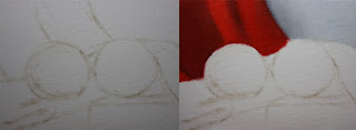
I started with the usual dry brush approach just using a bit of raw umber on the brush and no mediums.  Once the drawing was established I painted the background and the back section of the red cloth.  The colors I used for the background were ultramarine blue, titanium white and naples yellow.  For the red cloth I used naphthol red, cad. red, raw umber and ivory black.  When working in the cloth section I start by just laying in the values with their appropriate colors to match the hue.  I keep the transitions soft and make sure to not have any hard edges, this is my beginning layer and want to keep it as thin as possible.  
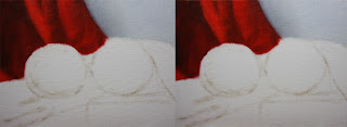
Then I start by adding the darker values and their specific forms, by doing this I start sculpting into the initial layer.  Once the darker forms are about complete I then paint in the lighter values with their specific forms.  By now I start to see the section coming to a completion, I start going back and forth from the darker values and pushing it to compliment the lighter values.  
Then I repeat the same process with the red cloth in the middle ground.
Once that section is complete I then move onto the first blood orange.  I start by painting the big form modeling in which the light is wrapping around the form.  Laying in a close approximation were each value scale should go with the right chroma to compliment it.  I also make sure to keep this stage of the painting thin, making sure the form is turning and it looks dimensional.  The colors I used for this section were cad.orange, cad.yellow pale hue, naphthol red, raw umber and ivory black. 
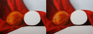
Once the big form modeling is complete I start to state middle to darker values with their specific forms.  When adding the smaller forms in this section I am able to use the initial layer that I stated in the big form modeling stage, this helps my blends go smoother and quicker it keeps a unified look.  It also allows me to go thicker and textured if desired to do so, it gives me the control i'm looking for within each section.  Once that section is about complete I start on the lighter values and highlights.  By the time I get to the end of this stage I am able to go back to the previous section,  I alter some values and chroma's that I didn't notice when the lighter values were not painted.
I repeat the same process with the second blood orange.
Once the blood oranges are complete I then start on the on the wooden board.  First painting the fall of light by keeping the values and colors generalized.  At this stage i'm not looking for details just a generalized information of the light and color.  I also make sure to keep this stage as thin as I can, doing so makes it easier to build layers and keep control.  The colors I used for this stage were raw umber, titanium white, ultramarine blue, cad.orange, and ivory black.
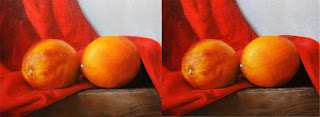
Then I paint in the middle to darker values with their specific forms, I start narrowing in the smaller forms by adding its specific characteristic.  I do the same when adding the lighter values and highlights.  After this stage is complete I go back around and see if I need to push anything or if I've missed a certain part.  I go back into the background and grey it down a bit, I thought it was competing with the foreground for the most part.  Well this painting definitely was a longer one to explain with each of its intricate sections.  It was so much fun painting them and also being able to explain each section, thank you for stopping by and viewing.