Showing posts with label Green. Show all posts

Tuesday, November 25, 2014

Green Heirloom Tomato

Sold
"Green Heirloom Tomato"
5 x 7 in
Oil on Canvas Panel

I have not painted these little gems in a while. The color of this heirloom caught my eye right away. They have such intense pure colors. What I enjoy most is the subtle values between the colors from one area to the other, painting that is challenging and rewarding once it's achieved. Painting light wrapping around this form is challenging but very educational to try. After painting this tomato my wife added it to our dinner which was as delicious as it looked. 

I started with the drawing stage by just using a bit of raw umber on the brush. Thinking of it as one would draw with a pencil. The pressure you apply to the brush it effects the value and intensity your marking will be. Once the drawing stage is complete I add local colors to the whole painting. This allows me to see how the painting will look in the completed stage with the colors I am thinking of. The next stage I then start to fill in the middle to darker values to all the objects in the painting, from the wooden board to the heirloom tomato. Then I add the lighter value forms to tie everything together. With this technique, especially being in alla prima, one has to has to be careful with the amount of paint being applied from the initial stages. Remember fat over lean, you want to start thin and get progressively thicker towards the finishing. I am also conscious of how many pressure I apply to the brush, as stated before I think of it as drawing with a pen or pencil. The lighter the pressure the lighter the value will be, the harder the value the darker the value will be. This also allows you to control smoother transitions. 

Thank you for stopping by and viewing. Cheers!

Wednesday, April 18, 2012

"Green Vase"

Sold
"Green Vase"
6 x 6 in 
Oil on Canvas Panel
Today I saw this vase around the house and saw how much I liked the way it looks on these wooden panels.  There's no particular explanation why I chose to paint this just the sole purpose of getting inspired by what I saw at that moment.  It's great being able to pick up the brush and just paint what you see, I was not planning to paint today but I did see this vase and how the light was hitting it and just had to.  There's beauty in everything we see I know it sounds cheesy but its very true, it can be the most mundane thing and it still has some beauty to it.  It just matters how one perceives what he or she is looking at.  
I started with the usual dry brush approach of using just a bit of raw umber on the brush for the drawing stage.  After the drawing stage I stated the local color in the vase by using viridian, cadmium yellow and raw umber.  When stating the general colors I am also stating the big form modeling, i'm not stating the extreme values of the darkest and lightest values just a close approximation to get a base down.  The extreme shifts of values I leave towards the end of smaller form modeling.
Then I start stating the middle to darker value within the vase, this is where I start stating the darkest values to get the point across that the form is turning.  Then I state the lighter values with their specific forms, this stage I also state the highest value or highlight to tie it together. 
After the vase is done I moved on to the background and stated the base and background together.  I used ultramarine blue, raw umber, naples yellow and titanium white for both.  I hope you enjoyed this simple and quick painting, thanks for stopping by and viewing.


Monday, March 26, 2012

"Mixed Tomatoes II"

Sold
"Mixed Tomatoes II"
8 x 10 in 
Oil on Canvas Panel
I wanted to continue the play on colors with these delicious tomatoes, I especially wanted to have an array of colors with an interesting composition.  The textures in their skin is extremely subtle along with their color shifts.  I felt for the most part I was painting mini balloons, never painted balloons before and now have an idea on how to do so.  With this painting I wanted to revisit big form modeling and implore that idea further.  I've stressed in previous posts about the importance of big form modeling and with this posting I'll do the same.  Playing with so many elements at once is challenging but delightful after seeing its completion from start to finish.
I started with the usual dry brush approach using no mediums and a bit of raw umber on the brush.  Once the drawing is complete I state the general colors of the tomatoes all at once, I do this to get unity out of the group of, this also lets me create a base to move my paint around and have that unity from beginning to end.  In this stage I am not concerned with big form modeling or details just the general flat color of the area.  The colors I use for this section are cad.red, cad.orange, cad.yellow medium hue.
After the general stage is complete I then start on big form modeling, this stage I start adding different colors that help turn the form with its light.  Still not worried about "details" or small form modeling just on how the form is turning away and into the light.  It's important to state that this stage is crucial in order to have a successful completion to your later stages.  I also stated the background in this stage to tackle the edges further.  Big form modeling is essentially laying down all the ground work for you, the smaller forms later or the "details" will lay in perfectly if the big form is done right.  With big form modeling I don't lay in the highest highlight or darkest value just a middle of the two to get the form turning.  Then on the next frame you can see that I laid in the smaller forms with the darker values and lighter values.  I like to break them up into two sections starting with darker then lighter values.  These sections work just right with the big form modeling, of course there is some areas that need fine tuning in order for the smaller form model to work right, but for the most part big form modeling lay's out the blueprint for each section you'r painting.
Once the tomatoes are complete I then start on the wooden base by approaching it the same way as I did with the wooden base.  First laying in the general colors and then doing the big form modeling or a fall light across the board.  Again not worried about the grainy textures in the wood just on the general light moving across the form.  This stage I am not applying the lightest or darkest values, I get close but stop since I add those details with the finishing touches.  Then on the next frame I state the smaller forms by first applying the darker values with their specific forms.  For this stage I used primarily burnt umber, raw umber titanium white, naples yellow and cerulean blue.
Once the darker forms are complete I state the lighter forms and take the wooden board to a finish.  I can see after adding the overall value of the base that the tomatoes started to look lighter in the darker areas, which is normal if you add a darker element next to it.  I went back into the tomatoes and darkened certain sections in order for them to work with the whole painting.  I hope you enjoyed this one and really had an understanding of my concept when I paint.  I appreciate you guys stopping by and viewing, till next time au revoir! 


Thursday, March 15, 2012

"Mixed Tomatoes"

Sold
"Mixed Tomatoes"
8 x 10 in
Oil on Canvas Panel
I'm finally back after such a long hiatus, I've been working on larger paintings and also ball point pen drawings.  I've decided to slow down a bit with these alla prima's and concentrate a bit more on my personal art work.  I felt as if these alla prima's started to become my identity as an artist and their sole purpose from the beginning is to just be practice paintings, in which they are.  I'm diving into larger more allegorical paintings, which means they do take longer to produce and I will not be devoting as much time to these alla prima's.  It's hard to not paint these little guys every day but I have to force myself in order to really produce a body of work that truly speaks as to who I am as an artist.  I plan to still produce one or two a week of these alla prima paintings after all I do love painting them and learn so much every time I finish one.  
On a side note I'll be teaching again this week coming up on the 22nd of March figure drawing at the Bloomington Art Center.  You can check out their site here and sign up for my class!

You can still sign up for my "Pink Roses" lesson!

Tuesday, February 7, 2012

"Lemon Plums"

"Lemon Plums"
6 x 6 in
Oil on Canvas Panel
These lemon plums caught my eye in the grocery store I could not get my eyes off of them.  They are unique looking to say the least and you know automatically I have to paint it.  I really like their colors and how orange their tips are.  Along with the colors I enjoy their textures, they are subtle but painting the smooth to rougher texture in one plane was a nice challenge.
I wanted to remind everyone that I am doing a painting demo this Thursday at Dick Blick in Edina, Minnesota from 10:45 to 2:00pm.  I hope to see you guys there! 
I started with the usual dry brush approach for the drawing stage.  Once the drawing is complete I stated the big form modeling with a very thin mixture on the brush, its a dry brush approach as well.  
I then just concentrate on the darker values with their specific forms.  Once thats completed I move onto the lighter forms and continue the same process.
I repeat the same process on the second lemon plum till its completed.    
Once the plums are complete I state the wooden base by applying a thin coat for the base.  Going back to the plums you can see that I start really thin with my mixture, this allows me to control my values from the brush touching the canvas.  Think of it as rendering with a pencil, once you put the pencil to the paper to get the subtle rendering you need to have a soft touch, same idea.  When I need the colors or values to be stronger and more opaque I'll go thicker with the paints, but I do so in a slow manner making sure the transitions are working within each other.  
Then I paint in the darker values with their specific forms and do the same with the lighter values.  
Once the wooden base is complete I start on the background, in this stage I make sure to take my time in polishing all the edges.  Thanks for stopping and viewing, hope you enjoyed!


Wednesday, January 25, 2012

"Assorted Apples"

"Assorted Apples"
8 x 10 in 
Oil on Canvas Panel
These apples I've been wanting to paint for a while in this arrangement, I've always been intrigued with the texture and subtle colors apples have.  Each of the apples have a subtle variation to its texture complimenting the rougher texture the wooden base has.  It's interesting applying the technique I did with the roses and rockwell study to this painting, of course it was't working right of the back but after a while it started coming together.  That's another thing I wanted to discuss on here about sticking it out till the end with you'r painting, no matter if its an alla prima or a longer still life painting.  In every painting that I do I always run into rough patches and think its not going to come out, but I keep going working hard until it finally does work.  Easier said than done but trust me if you push your self and not settle it will push you and your painting into that next level.  Thanks for stopping by hope you enjoyed!

Monday, January 16, 2012

"Strawberries Marching"

Sold
"Strawberries Marching"
8 x 10 in
Oil on Canvas Panel
This is the last of the series of strawberry paintings, I had a lot of fun playing with their arrangements and seeing how far I can push it.  Their intense colors is also another reason why I wanted to continue painting them, their reds are just so strong and when you add details on top of that it just changes the dynamic of the chroma's.  Strawberries are tricky to paint because of their textures they have an alignment with their dots that can get confusing from one to the other, each of them have their subtle differences.  The best part of the whole experience is being able to eat them afterwards, when you add chocolate to the mix then its just icing on the cake.  
 I am doing a demo at Dick Blick in Edina, MN on February 9, I was going to do it from 12-3p.m. but due to prior engagements I have to change the time from 11-2 or 10:30- 2p.m.    
  
You can still sign up for "Pink Roses" alla prima lesson, check out the trailer above.

Thursday, January 12, 2012

"Strawberries Aligned"

Sold
"Strawberries Aligned"
5 x 7 in 
Oil on Canvas Panel
I wanted to continue with the play of composition with these strawberries, I enjoy painting their deep reds and even more eating them.  It's fun playing around with subject you paint and try to compose them differently each time, you never know what you'll end up with unless you just try.  The weather finally came around it started to drop as of yesterday to the teens, I have to admit I do miss the 50 degrees we had a couple days ago.  It is nice though to stay indoors and paint when its this cold, hopefully we won't see negative 40 degrees any time soon it truly is unbearable.
I wanted to let everyone know that lives in Minneapolis I'll be giving a live painting demo at the Dick Blick in Edina on Feb. 9th from 12-3 pm.  Come out and heckle me would love to meet you guys.
I also found out my oil painting class at the Bloomington Art Center will be on for this session, I'm extremely excited to teach it along with figure drawing and see the talent that comes out of there.  You guys can still sign up here's the link.
Sign up for "Pink Roses"Alla Prima online lesson, check out the trailer above.
I started with the usual dry brush approach using a bit of raw umber on the brush and no mediums.  After the drawing is complete I laid in a general color for the strawberries and also stated the background.  I usually do not use any mediums with these smaller alla prima's, i've gotten used to not using any and just using the paints straight out of the tube.
Then I stated the darker values and their specific forms and did the same with the lighter values and highlights.
After the strawberries were complete I then started on the leaves and started with a general color for the drawing in stage.  In this stage I am just drawing in the shapes and trying to place them in the right areas.  Once the shapes are correct I then state the darker values and their specific forms.
Then I state the lighter values and their specific forms.  Once the strawberries are completed I then move onto the base and add the general colors with some details already filled in.
I then go back and add the finishing touches on the strawberries and base, doing this brings the whole painting to a finish.  I noticed with this painting I did not apply my usual big and small form modeling and could see the difference.  It's something that is really important with my paintings and can tell right away if I forgot to implement it.  I do like the results though and still kept in mind on how the form turns with the light.  There is a difference though when you go through the process and actually do it step by step rather than jumping ahead and putting in all the information at once.  I hope you guys enjoyed this one, thanks for stopping by.  


Tuesday, January 10, 2012

"Three Strawberries"

Sold
"Three Strawberries"
6 x 6 in
Oil on Canvas Panel
The weather here in Minneapolis is crazy today it hit 50 degrees, I cannot believe that its fifty degrees in the middle of January it's usually five below at this time of year.  It's pretty hard to stay indoors and paint when it's so nice outside but I must paint and get back to the easel vacation time is over.  I haven't painted strawberries in a while I miss painting their unique textures and beautiful colors.  I wanted to arrange them with this silver serving cup, I've used this cup in several of my paintings and like the reflections it creates.  It was fun arranging this composition and getting back to the grind of making these alla prima's.
I started with the usual dry brush approach for the drawing stage, once the drawing stage is complete I stated the background by using ultramarine blue, naples yellow and titanium white.
After the background is complete I start on the three strawberries at the same time by stating the general colors.  After the general colors are stated I start stating the darker values and their specific forms.
Then I stated the lighter values and highlights, I work on all the strawberries at the same time to keep the quality the same.  Once the strawberries are complete I start on the green leafs on the strawberries by first stating the general colors, then laying down the darker values and after putting the lighter values
Then I start on the silver cup by laying in the general colors, I like to keep this stage abstract and also keeping the edges soft.  Then I state the lighter values and start bringing the two sections to a finish.  
Then I move onto the base and first state the general colors, at this stage I have already starting to indicate the darker and lighter values.  Then I state the darker darks and bring the painting to a finish.


Saturday, January 7, 2012

"Buddha's Hand Citron"

Sold
"Buddha's Hand Citron"
8 x 10 in
Oil on Canvas Panel
This is my first painting of 2012 and what a way to start the new year with a freaky looking one, you guys know me and painting weird looking fruits.  I was at the grocery store today and could not believe this was actually a fruit, I quickly picked the best one and hurried home to paint it.  It's so unique looking  seems as if its alive, amazing what mother nature can make just when you think you seen it all.  The textures on the citron were amazing to paint, love the smooth and rough textures it has.  Aside from painting it there was a piece of paper that came along with it when I bought it, gives information of where it comes from and how to cook it.  Interesting to know that they are only available from October to January, and mainly used for making jams and liqueurs.  
I wanted to also say thank you to everyone for your support last year in following my blog and commenting, I really do appreciate it.  I wish everyone the very best for 2012!  Here is the clip for my "Pink Roses" lesson thats available for purchase:
  
Thanks again everyone and Happy 2012!
I started with the usual dry brush approach using no mediums and a bit of raw umber on the brush.  Once the drawing is complete I stated the background first by using ultramarine blue, naples yellow and titanium white.  
After the background is laid in I state the general colors of the citron, I would do big form modeling to it but since the textures and tentacles are complicated I'll just slowly build my rendering through each stage instead of generalizing all at once.  The colors I used were viridian, cad.yellow pale hue, raw umber, and cad.orange.  Once the general colors are stated I went in and painted the darker smaller forms, the colors I used for this stage was primarily raw umber.
Then I laid in the lighter values with smaller form modeling and I just applied cad. yellow pale hue and titanium white.  When I stated the lighter values this allows me to go back into the darks and shift certain values to their right hue, I constantly jump back and forth till it looks right.  Once the citron is complete I move onto the wooden board by just using raw umber for the general color lay in.  
After the general color lay in I state the darker values by using ivory black, cad.orange, naphthol red and raw umber.  Then I complete the painting by adding the lighter values to the wooden board by adding titanium white, ultramarine blue, naphthol red and cad.orange.  When Adding the wooden board and the cast shadow from the citron I notice that the values within the fruit can go a bit darker, that's why sometimes its better to add the darkest values first to properly judge how dark you need to go with the subject your painting.  Hope you guys enjoyed this freaky looking fruit I know I definitely did and was scared at the same time ;)


Friday, December 2, 2011

"Forelle Pears"

"Forelle Pears"
5 x 7 in 
Oil on Canvas Panel

These pears are neat looking and their named Forelle, I want to know how they came up with that name?  A lot of these fruits I've painted have some odd names to them and I've always wondered how do they go by naming them, interesting to say the least.  The coloring on their skin is really nice the way it goes from light green to yellow and red, a beautiful array of colors going from one to the other.  I also thought it'll be nice to pair it up with the red cloth that i've painted before, for some reason I think it compliments these pears pretty well.  Last but not least the wooden board is peeking out in the corner reminding us that its still here, I like to say its been nice to not paint it for a while but I do miss it at times.  Thank for stopping by and viewing hope you enjoyed it! 
  

Wednesday, November 16, 2011

"Blue Eggplants"

Sold
"Blue Eggplants"
8 x 10 in 
Oil on Canvas Panel
It's good to be back painting after being out of town again, I went to go visit my girlfriends family in Utah.  It was so beautiful to go up to the mountains and relax, I wish I brought my paints although I know I wouldn't have time to paint.  I just returned and wanted to paint these baby eggplants with a blue cloth, I really like the combination of these two.  In comparison to painting the red cloth I do have to say the blue one is more challenging, I do like the challenge and hope to continue to incorporate this beautiful cloth in future paintings.  It's always rough to paint after not painting for a while but you have to get over that hump and get the wheels grinding.  I hope you guys enjoyed this one, thanks for stopping by and viewing!  

Tuesday, November 8, 2011

"Quince Pineapples"

Sold
"Quince Pineapples"
8 x 10 in 
Oil on Canvas Panel
These pear of unique pineapples I saw at the grocery store is something i've never seen before, I knew right away I had to paint them since their not the usual pineapples I'm used to.  I've been wanting to paint this red cloth for a while and thought pairing it up with these pineapples would be perfect.  Having to adjust to the daylight savings time has been a bit tricky to do, I have to start these paintings much earlier so I have sufficient natural light to paint with and to take pictures.  I haven't found anything that replaces using natural light it's the best source of light to use in order to have the purest colors.
I started with the usual dry brush approach using no mediums and a bit of raw umber on the brush.  Once the drawing is complete I stated the background and red cloth, with the red cloth I state the fall of light or how the light falls across the form.  The colors I used were ultramarine blue, naples yellow and titanium white.  The colors I used for the cloth were cad.red light, and ivory black.
Then I start to work on small form modeling by first stating the darker values with their specific forms. After the darker values are done I proceed to the lighter values and their highlights, for the lighter red areas I used a bit of cad.orange mixed with cad.red light.  After the cloth is complete I can then move onto the pineapples by concentrating on big form modeling, at this stage I'm just worried about stating the general colors and how light wraps around the form.
Once the form is turning and appears dimensional I can then start on small form modeling, at this stage I like to break it into two parts.  The first part starting with darker values and their specific forms and when thats complete I finish it off with the lighter values and their highlights with their specific forms.  The colors I used for the pineapples were viridian, cad.yellow light, titanium white, cad.red light, ivory black and ultramarine blue.  Painting cloth in a still life is something I've always enjoyed, one can learn so much by its folds and how color and light falls on each plane.  It compliments well whatever its paired with and I get a lot from the experience painting it.  I hope you enjoyed this one thanks for stopping by and viewing! 


Thursday, October 20, 2011

"Seckel Pears"

Sold
"Seckel Pears"
6 x 6 in
Oil on Canvas Panel
I saw these pears this morning at the grocery store and what really caught my attention is that they look like mini pears, they are literally half the size of regular pears.  Of course anything that seems out of the norm catches my attention and I have to paint it.  What also grabbed my attention with these guys are their textures, I wanted to examine them further with the paints.  I'm in this stage now that I want to push my handling in textures, I want to make the paint seem as its alive rather than over blended and dull.  That's the wondrous part of painting is that you can never be content, as for me I always try to push myself to get better and that's the beauty of these alla prima's.
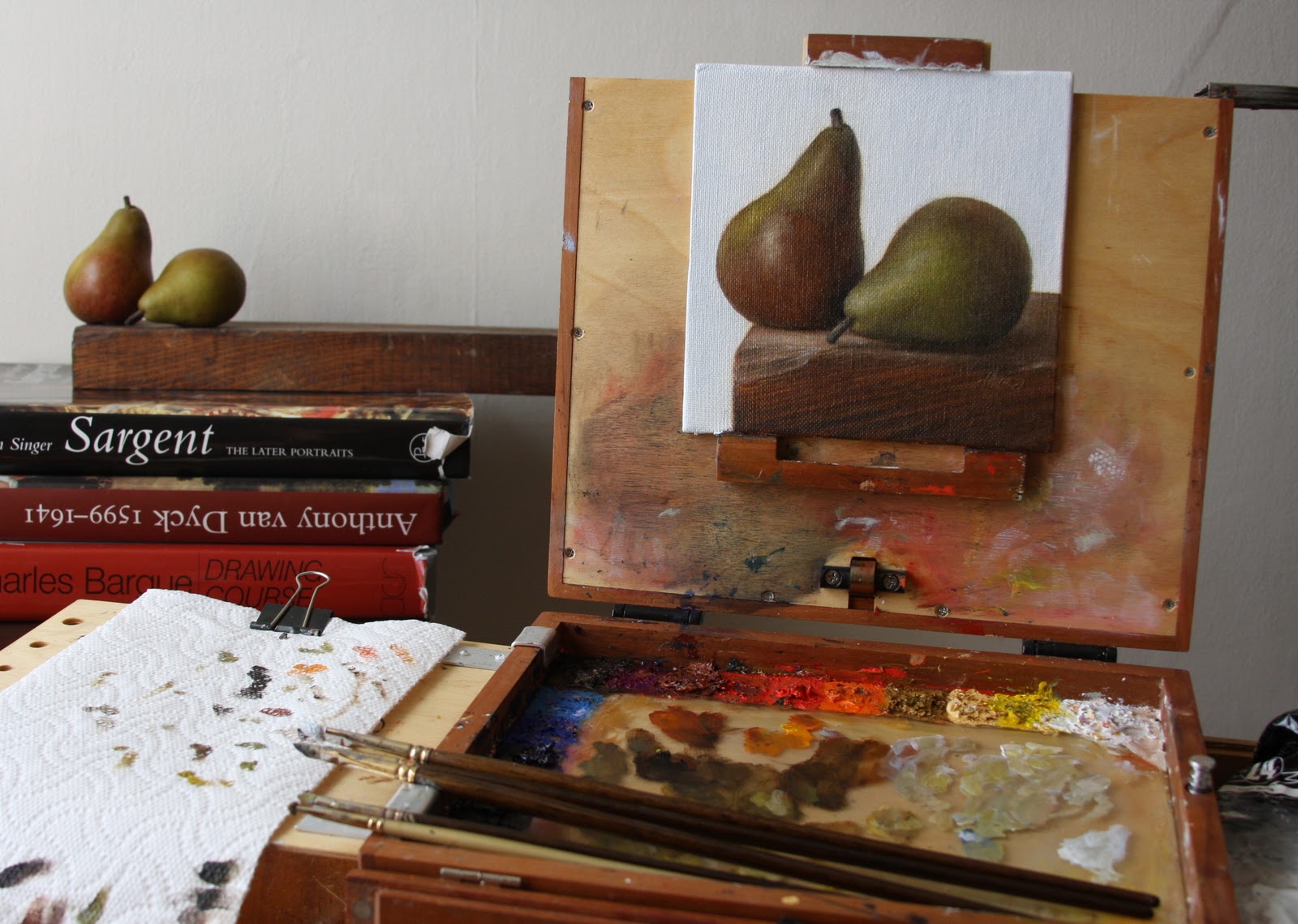
Setup.
I started with the usual dry brush approach just using a bit of raw umber on the brush.  Then I stated the background and wooden base after the drawing is complete, I just concentrated on the fall of light and big form modeling with the general colors.  The colors I used in the background were ultramarine blue, naples yellow and titanium white.  The colors for the base were raw umber, burnt sienna, ivory black, ultramarine blue, and titanium white.
After the big form modeling is complete I started with the smaller form modeling, in this stage I like to break it up in two stages first starting with the darker values.  Then to finish the smaller form modeling stage I state the lighter values and their highlights.  
I start on the first pear after the wooden base is complete, again just stating the big form modeling stage with their general colors.  All I'm worried about in this stage is just turning the form with the light and general colors, not interested in details remember they are no use until the bigger form is working right.  With these pears since their overall values are darker handling the darker value stage is done when dealing with big form modeling, I only have to worry about the lighter values and highlights for the smaller form modeling.  The colors I used for the pears were viridian, ultramarine blue, naples yellow, raw umber, ivory black, cad.yellow light, burnt sienna and titanium white.
I repeat the same process with the second pear and take it to a finish.  
Another pic of the setup this time with the finished painting.  As you can see with my palette I don't use globs of paint in the beginning, I like to gradually build up to the thickness I'm going for.  I hope you enjoyed this one I know I certainly did, thanks for stopping by and viewing.