Showing posts with label garden painting. Show all posts

Friday, March 14, 2014

"Star Fruits"

"Star Fruits"
8 x 10 in
Oil on Canvas Panel

Something about the last post must of had an effect on our weather, the temperatures started getting warmer and I am loving every bit of it. Spring is definitely right around the corner, now to just melt all the snow thats accumulated. I wanted to continue the alla prima serious with another painting of star fruits. Their color and texture really attract me. It has a nice variation of smooth and rough texture, not to the touch but more visually. I forgot how much I really enjoy painting alls prima's, I find it to be the same experience as drawing in my sketchbook. It's a way I can just set up a small little still life and just practice away. 


Thank you again everyone for stopping by and viewing my painting. Hope spring is around the corner for you as well.


Sunday, March 9, 2014

"Contact"

"Contact"
8 x 10 
Oil on Canvas

I hope everyone is keeping warm in this brutal winter polar vortex. This winter has tested our patience and hopefully will let up soon. I wanted to do an alla prima painting of these star fruits to remind me summer is around the corner. It was fun painting alla prima again, to try to finish the painting in one sitting was challenging after not doing for a while.  Can't wait to produce more of these alls prima's to get back on the band wagon.


Thank you for stopping and viewing my painting. Stay warm!


Monday, January 6, 2014

"Pink Peonies"

Sold
"Pink Peonies"
12 x 9 in
Oil on Canvas Panel

Happy New Years everyone! I have so much to be thankful for such a wonderful year, excited to see what the future has in store. Can't think of any other way to ring it in other than painting.  I have been wanting to paint for a while and finally after all the holiday festivities I was able to do so. Peonies have always been a personal favorite of mine to paint, their color and texture are a big draw to me. It's a subject in which if you try painting every single hair on a dog it will not work in your favor. Either way it's a challenging subject matter to paint, but always a pleasure to do.

I start with a very thin layer of raw umber, not using any mediums either. I do not use any mediums through out the duration of the painting, I like to keep the toxins level as low as possible. This stage I like to concentrate mainly on the composition and placement of shapes. I am not concerned with details or getting everything perfect, just getting the overall placements in the right areas. Later on through the painting the shapes shift here and there that's why I like to keep this stage fairly loose. You can think of it as a gesture drawing, not concerned with proportions or details, just the sole of the drawing, the movement of life through out the drawing. 

Once the drawing is complete I then start with the peonies and its stems. This is the big form modeling stage. I am only concerned with getting the overall chroma and the turning of the form correct. Still not worried about details, just turning the form with the lights and correct chroma.

Once the big form molding stage is complete I then start with smaller form modeling. In order for this stage to work the big form modeling needs to be correct. I have found with a lot of my students they like to rush through this step. The importance of getting that stage right is overlooked at more often than not. Smaller form modeling is just a miniature version of big form modeling. 

I am still not completely done with smaller form modeling since the background and leaves are not done. I lay in the background and really like how it pushes the peonies forward.

I keep going back and forth with the small form modeling stages through out the peonies and leaves. The painting is finally complete and really satisfied with it. These peonies get me excited for the summer after these sub zero temperatures we are experiencing. 

Thank you for stopping by and viewing, wishing everyone a Happy New Years! 


Tuesday, December 17, 2013

"White Ranunculus"

Sold
"White Ranunculus"
10  x 8 in
Oil on Canvas Panel

Hi everyone, it has been a long time since I posted especially an alla prima painting. This year has been a whirl wind for me, an amazing year to say the least. After the wedding this summer I dived into several commission projects, one of them I was able to share on the previous post.  A long with working on those projects we have become new home owners! I still cannot wrap my mind around it. A little scary but amazing to own our own home. I know thanksgiving is long passed but I have many things to be thankful. I could not have dreamed for such an amazing year and what it's still surprising us with. I wanted to thank you guys as well for still reading my blog, even though this passed year I have been very limited on how much I have posted. I swear when I say I'm trying to get better in posting regularly, it's hard to post about painting walls when all I want to do is paint on canvas. 

I've stated in previous post I was not going to paint alla prima paintings for a long time, well, long time has definitely passed. I really do miss doing these little guys. They are equivalent to sketching in your sketchbook when practicing. I have not painted in a while do to the move and we are still getting situated in our new home.  Painting this alla prima gets the blood flowing again, gets my routine going with painting. I will never stop doing these alls prima's for that reason a lone, it allows me to always practice fine tuning my craft, which I think we should always keep doing as artist. This painting is the first painting to be done in my new studio, fitting to say the least. I did not want to just post the finishing painting, I miss explaining my process. It's always beneficial to share your process no matter what your style is, there's always going to be someone out there that will benefit from it. 

I started with a dry brush and raw umber for the drawing stage. In this stage I like to keep the drawing simple and clear. Not worried about details, just concerned with placement and proportions.  

I then fill in the basic colors for all the sections of the painting, this is the only stage I work everything at the same time. I do this to get the overall tone of the painting from the get go. I work with big form modeling at this stage as well. The point of big form modeling is to state how the lights and basic color note wraps around the form. The colors I use is naples yellow, raw umber, viridian, cerulean blue, cadmium yellow. 
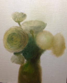
I know all my shapes are not final when I move on, I like to have the freedom to be able to move things if I need to. Now I start concentrating one section at a time. After big form modeling is complete I start with small for modeling in the darks. I start with the left side of the flowers, first by stating the middle to darker tones. I do not like to state the darkest darks first, I like to slowly move into them by starting with a middle tone. I am using the same colors as I did in the previous step. The good thing about this method is that you'r painting wet into wet, the tricky part is to not get to muddy or thick quickly. 

Once the smaller forms for the darks are complete I move onto the lights. I like to jump between those two stages to get to the right look I'm going for.

I repeat the same process with the right half of the flowers. First by stating the darker smaller forms. An important thing to understand with smaller forms, they can only exist if the big form modeling is done correctly. Small form modeling is the icing on the cake, all your work is mostly done with big form modeling. A lot of people like to jump straight into small form modeling or the "details" instead of concentrating on big form modeling. Big form modeling stage is extremely important to get right, it's the stage where you have to make the lights believable. 

After I worked with smaller form modeling of the lights I moved onto the vase and vines. I apologize for not showing more process from that point. I essentially repeated the same process what I did with the flowers. I changed the vase to fit better with the overall composition. After the vase was established I went back into the flowers and brought out the lights and darks more.  I keep tweaking sections that have changed by values I established in other areas. I constantly walk back forth from the painting, especially towards the end. The painting looks much different when standing back, I never judge my values and chromas from up close, always by standing back. I could keep working on this painting, but I have to stop, especially when I feel it served its purpose. 

Thank you again everyone for tuning in and interested in seeing my paintings. I appreciate all the support. I hope you guys enjoyed this one, see you guys soon!


Monday, February 13, 2012

"Black Grapes"

"Black Grapes"
6 x 6 in
Oil on Canvas Panel
These grapes were so much fun to paint, I've mentioned before that I love painting textures and these grapes and wooden board delivered.  I tried my best to get a great picture without the grain of the canvas coming through and this is the best I can do.  Normally you cannot see the grains when looking at the painting but the way the natural light was hitting the canvas the camera picked up more than usual.  I also mentioned in other posts that one my idols in painting is Norman Rockwell, I just love all his paintings.  The way he painted light and texture is purely amazing, over the weekend I was studying a lot of his paintings I just can't get enough.  I saw one of his books at this great book store and its huge!  I think I might buy the book the quality and reproductions are great, seeing the paintings with its texture is purely delicious.  I find that bigger the book the better the quality is and one is able to observe in an intimate level.  As you can tell my addiction to books is beyond help, I find they teach us so much if we observe properly to what the artist is communicating.  
This is the start of the painting as you can see I am working with natural light which I believe is the best way to paint from.
Picture of the finished painting next to the setup, thanks for stopping by and viewing!


Monday, January 23, 2012

"Rosas Bianco"

"Rosas Bianco"
9 x 12 in
Oil on Canvas Panel
Over the weekend I did a study of a Norman Rockwell painting and learned so much from it.  I love doing copies because I always get something out of it.  Norman Rockwell is one of my idols, I love the way he paints texture on every subject he paints.  I also love the way he depicts stories in his paintings, he is known for being an illustrator to me though he is a fine artist as well as an illustrator.  I recommend to any painter out there that wants to keep learning and improving on their skills to copy a painting they really admire, you will gain so much out of it from the color choices to the brush strokes they used.  When I started painting this one today I thought it would of been a walk in the park, well I was in for a rude awakening.  White roses are extremely hard to paint due to their subtle colors, if you don't control the value and colors it can get really bad quickly.  I cannot tell you how many times I was just going to stop with this painting, especially after doing the copy I thought I was just going to easily get this one done.  Once I completely started to concentrate on the light and how to render its textures on the leaves and roses the painting started to come along.  When I was painting the leaves that's where I saw the light in the end of the tunnel, I started to remember what I learned from the Rockwell study and put those two together.  I'm glad I stuck it through I learned so much and really happy with the results.  I hope you guys enjoyed this one, thanks for stopping by and viewing.
Norman Rockwell copy.

Tuesday, November 1, 2011

"White Roses"

Sold
"White Roses"
8 x 10 in
Oil on Canvas Panel
These white roses I first saw at my girlfriends sisters apartment and knew right away I had to paint them.  White can be such a subtle and difficult color to paint, it can retain so many different hints of colors that it can easily get to muddy.  Knowing how much I like to challenge myself with these guys I was definitely looking forward to it, not mentioning the background too how easy it is to get your palette muddy by using so much black.  All these components make a great experience in painting this subject, it teaches you many factors that go into controlling your craft and how far you can push your sense of color while being subtle.  When I was studying at the Atelier I remember the first cast I painted in color, it was an all white cast which I thought would be simple to paint since it was just one color with a green background and the color of the base.  I cannot tell you how many colors I used in that cast it had so many subtle hints of every color you can imagine, its incredible how your eye can play tricks on you or you think its just a plain color which in reality is not.  Needless to say I learned tremendously from that cast painting and so on, and it also reinstates what I tell my students observe everything you draw and paint to the teeth.  

Friday, September 9, 2011

"Fuchsia Orchids"

Sold
"Fuchsia Orchids"
9 x 12 in
Oil on Canvas Panel
I didn't have to go far to get inspired to paint.  My girlfriends birthday was just the other day and she got a lot of flowers, you can say we have a garden growing by the day.  I wanted to paint this picture using natural light, I'm used to painting in artificial light because it's the way I was trained, although I know there's nothing like painting in natural light.  The only thing I don't like about it is that I have to sit down the whole time.  I paint in my kitchen to get the best natural light and the space is pretty tight so sitting is the best option.  That being said I really enjoyed the whole experience from the beginning to end, as stated before there's nothing like painting from natural light.  Orchids are challenging to say the least.  Their colors are pretty subtle and you have to be aware in the change of values that occur really quick.  I haven't painted orchids in a while and glad I did so, it really pushed me in studying these orchids in depth in every way.
 This is my set up from the kitchen with my pochade box and the model.  
I started the drawing with a bit of raw umber on the brush and no mediums.  Once thats complete I stated the general colors of the orchids and stems.  The colors I used were quinacridone magenta, cerulean blue, and cad. yellow.
Then I stated the background to give the painting more of a whole look.  The colors I used were yellow ochre, cerulean blue, and titanium white.  Once the background was complete I started with the first set of orchids by stating the darkest values with their specific forms.  I start using naphthol red, and ultramarine blue in the mixture.  
Then I add the lighter values with their specific forms, I also start on the other set of orchids by just implying the middle to darker values.  When stating the lighter values I had to slow down and be very subtle with the value shifts, orchids have a delicate and subtle texture to them.  Then I added the darker values with their specific forms to the other set of orchids.  
I finish the painting by adding the lighter values and darkening the cast shadow in the background.  
Here's a look of the finished painting on the pochade box next to the orchids.  I enjoyed this painting to say the least, I did go through some points when I was not gonna finish but glad I stuck through it to the end.  Painting difficult subjects are always a challenge, I've learned if you stick through it you'll benefit so much from it.  I hope you guys enjoyed this one, thanks for stopping by and viewing!


Tuesday, September 6, 2011

"Orange Roses"

Sold
"Orange Roses"
9 x 12 in
Oil on Canvas Panel
These orange roses were so much fun to paint.  I always find that roses and flowers push me the most in painting and this painting was no exception.  From the size of the canvas, to the amount of roses to paint in one session, it was very challenging.  Roses are so beautiful in their shape, colors, and intensity, it makes a delight to paint.  Roses can get pretty tricky to paint at times but I learn so much every time I paint them.  
I started with a rough drawing in the beginning I didn't want to get to detailed in this stage because I know I'll get most of the details with the paints.  Once the drawing was complete I stated the general colors for all the roses and stems, I keep the paints fairly thin at this stage not going to thick.  The colors I used were cad.orange, viridian, raw umber and cad. yellow.
Then I stated the background with cerulean blue, naples yellow and titanium white.  Once the background is complete I started on the right roses stating the darker values and their specific forms, I concentrate on just the middle to darker values leaving the lights for the next stage.
Once the darks are taken to completion I start on the lighter values and their specific forms.  I repeat the same process with the roses to the right, again starting with the darker values and their specific forms.
Then paint in the lighter values and their specific forms and take the roses to completion.  Once the roses are done I start on the leaves, stems and vase.  I start with the darkest values and their specific forms.
Then I add the lighter values and their specific forms and take the painting to a finish.  It was fun painting this one and loved the challenges it brought.  I hope you enjoyed this one as much as I did, thanks for stopping by and viewing.  


Wednesday, August 31, 2011

"Peonies Bianca"

Sold
"Peonies Bianca"
8 x 10 in
Oil on Canvas Panel
These peonies were at my girlfriends sisters house and just loved how the light was falling on it, of course they're not in season anymore and at the time I was able to capture the essence of these peonies with my camera phone.  I usually like painting from life which is always the best way to go in order to get truer colors, but these peonies which I forgot I had in my phone were just to good not to paint.  It's a challenge to try to paint these beautiful flowers from a photo, they have such subtle colors that can be lost in a photo but since I've painting white peonies before I knew what to look for.  The photo wasn't actually bad at all, I think it captured most of the colors and subtle transitions I was looking for.  I do not plan to make this a norm taking photos with my camera phone but for this painting I think it works just fine.  The background was another challenge I was not looking forward to, to do a complete black background in one session is pretty difficult.  Painting with pure ivory black can get muddy really quick when mixed with other colors, I had to be extra careful to not mix it with the rest of my palette.  Like in any painting there's always challenges, the key is figuring it out and making a successful work of art.  
I started with the usual dry brush approach for the drawing stage, just a bit of raw umber on the brush.  I didn't want to get to exact with the drawing since I am painting peonies and prefer to do so with the paints.  After the drawing is complete I started stating the general colors of the peonies, just laying down the middle value of each color, not worried about stating the lightest and darkest values.  The colors I used were cad.yellow, viridian, ultramarine blue, yellow ochre and titanium white.
Then I started to add some of the middle to darker values to give more depth to the peonies, I'm still not worried about details trying to get a feel of the peonies and its textures.  Then I state the background by just using ivory black, this is essential in order to get the right values stated in the peonies.  Then I go back into the peonies and adjust the middle values to the correct hue.  Since the background predominately covers the painting its important to state that in the beginning in order for the values to work well with each other.  
Then I start adding the lighter values to the peonies and take them to a finish.  As you can see in both stages I decided to work all of the peonies at the same time, I believe this method works well when painting these types of flowers.  They have such a unique characteristic when painting them I feel its better to work all of them at the same time.  Then I start stating the vase and stems, as you may see the vase blends in with the dark background the only thing you can see are the stems.  The colors I used for the vase and stems were ultramarine blue, viridian and cad.yellow light.  
Once the vase is complete I go back into the peonies and add any finishing touches it needs, which then I complete the painting.  I really like this painting and the challenges it gave me, to do it in one session was a bit daunting but glad I did it.  I hope you enjoyed this one, thanks for stopping by and viewing!


Tuesday, August 9, 2011

"Subtle Roses"

"Subtle Roses"
8 x 10 in
Oil on Canvas Panel
I really liked the roses I painted at the demo, I decided to get another bunch that where similar and painted them again.  This time I felt I had more time and a better set up to paint.  These roses have so much beauty between each pedal, you have to be careful painting pedals they can become generic very quick.  The ferns also played a supporting role to the roses, I decided to keep them soft and not rendered as much as the roses.  This keeps more of the attention to the roses which was more of the direction I was going.  I did this painting in a flemish style, I was able to render the values with a burnt umber  and just concentrate getting all the tones right.  Once the tones are working I add color on top of the values, doing this allows me to have a stronger painting since the drawing and tones are in tact.  I'm a firm believer that you have to know how to draw in order to paint well, essentially painting is drawing just with a brush and some color.
I started the drawing with a bit of details in it, since I'm painting roses the placement of their pedals are important.  Once the drawing is complete I state the background with ultramarine blue, naples yellow, and titanium white.
Then I start on the first rose, as stated before I'm using the flemish technique to render each tone with a bit of raw umber.  I use raw umber because it's the middle overall value that I see in the rose.  I apply a very thin passage of paint at this stage, remember the point of this stage is to get the values working and also work the edges.  I'm thinking of this stage as a drawing,  I want the drawing to come out right before I apply color to it.  Then I apply the lighter values and their specific forms, I also apply color at this stage I do the same in the shadows.  Since the drawing is stated and working well with the values, it's simple to just apply color on top and blend it in with the values.  The colors I used for the first rose where raw umber, titanium white, ultramarine blue, cerulean, naples yellow, and cad. yellow light. 
I repeat the same process with the the second rose, I first render the rose with one color which is raw umber.  The reason I use this color is because I see its the middle overall value to that rose.  I stay in this stage until the drawing is correct and the values are perfect.  Then I apply the colors on top using quinacridone magenta, viridian, ultramarine blue, cad.yellow light, and titanium white.  
I then do the same with the third rose only this time I use a different color for the middle value, I used naphthol red, raw umber and ultramarine blue.  
Once the third rose was completed I moved onto the leaves and ferns.  I wanted to keep the simple and not to rendered, this allows all the attention to stay at the roses.  I didn't use the flemish technique in this stage, instead I just covered it with the middle overall value and worked into the darks and lighter values.  You can say I did the same approach to the red rose.  The colors I used for the leaves were viridian, ultramarine blue, cad.yellow light, and raw umber.  It was fun painting this one in a different manner, although its pretty similar to the way I usually paint I do like the flemish approach.  I plan to play more with this technique in future paintings.  I hope you enjoyed this one as much as I did, thanks for stopping by and viewing!