Showing posts with label yellows. Show all posts

Wednesday, August 31, 2011

"Peonies Bianca"

Sold
"Peonies Bianca"
8 x 10 in
Oil on Canvas Panel
These peonies were at my girlfriends sisters house and just loved how the light was falling on it, of course they're not in season anymore and at the time I was able to capture the essence of these peonies with my camera phone.  I usually like painting from life which is always the best way to go in order to get truer colors, but these peonies which I forgot I had in my phone were just to good not to paint.  It's a challenge to try to paint these beautiful flowers from a photo, they have such subtle colors that can be lost in a photo but since I've painting white peonies before I knew what to look for.  The photo wasn't actually bad at all, I think it captured most of the colors and subtle transitions I was looking for.  I do not plan to make this a norm taking photos with my camera phone but for this painting I think it works just fine.  The background was another challenge I was not looking forward to, to do a complete black background in one session is pretty difficult.  Painting with pure ivory black can get muddy really quick when mixed with other colors, I had to be extra careful to not mix it with the rest of my palette.  Like in any painting there's always challenges, the key is figuring it out and making a successful work of art.  
I started with the usual dry brush approach for the drawing stage, just a bit of raw umber on the brush.  I didn't want to get to exact with the drawing since I am painting peonies and prefer to do so with the paints.  After the drawing is complete I started stating the general colors of the peonies, just laying down the middle value of each color, not worried about stating the lightest and darkest values.  The colors I used were cad.yellow, viridian, ultramarine blue, yellow ochre and titanium white.
Then I started to add some of the middle to darker values to give more depth to the peonies, I'm still not worried about details trying to get a feel of the peonies and its textures.  Then I state the background by just using ivory black, this is essential in order to get the right values stated in the peonies.  Then I go back into the peonies and adjust the middle values to the correct hue.  Since the background predominately covers the painting its important to state that in the beginning in order for the values to work well with each other.  
Then I start adding the lighter values to the peonies and take them to a finish.  As you can see in both stages I decided to work all of the peonies at the same time, I believe this method works well when painting these types of flowers.  They have such a unique characteristic when painting them I feel its better to work all of them at the same time.  Then I start stating the vase and stems, as you may see the vase blends in with the dark background the only thing you can see are the stems.  The colors I used for the vase and stems were ultramarine blue, viridian and cad.yellow light.  
Once the vase is complete I go back into the peonies and add any finishing touches it needs, which then I complete the painting.  I really like this painting and the challenges it gave me, to do it in one session was a bit daunting but glad I did it.  I hope you enjoyed this one, thanks for stopping by and viewing!


Thursday, August 11, 2011

"Circus Plums"

"Circus Plums"
6 x 6 in
Oil on Canvas Panel
I wanted to revisit these fun plums and be a bit more whimsical, I also miss painting this beautiful marble top.  Painting these two surfaces together contrast each other nicely.  The tension this composition creates is pretty interesting, the plums seem to be having a hard time holding up the top plum.  You can create infinite story lines with this one, it'll be interesting to read what you guys can come up with?  I've always said if you want to better yourself in painting paint marble, it's so true.  Aside from painting flowers which also excels you in every way, painting marble teaches to control your medium and notice with each stroke the type of textures you'r laying down.  You can easily apply what you've learned to anything you paint, of course you have to conform it to the subject you'r painting.  I miss painting the wooden board I use for the majority of these alla prima's, but painting this marble has given me so much joy and teaches me something new every time.  
I started with the usual dry brush approach using no mediums and a bit of raw umber.  After the drawing is established I stated the background and middle value to the base, the colors I used where cerulean blue, naples yellow and titanium white for the background.  For the marble I used raw umber, ivory black and titanium white.
Then I stated the middle and darker values with their specific forms, and do the same with the lighter values.  Once the front part of the marble is complete I start on top and repeat the process.  
Once the whole marble is complete I start on the first plum by stating the middle to darker values first.  At this stage I'm applying the middle local color of the plum and turning the form, later I start to add more colors once the values are turning with the light.  Then I add the lighter values and take the plum to a finish, I repeat the process with the second plum.
I do the same process with the third plum.  The colors I used for the plums were naphthol red, ivory black, cad. red light, quinacridone magenta, cerulean blue, and titanium white.  
I take the painting to a finish by going in the cast shadows where the plums meet the marble, I tie them together by pushing the darks and blending the two together.  It was beyond fun painting this one, I truly enjoy learning from a painting and this one definitely delivered that.  That's what I love the most about painting these alla prima's, they teach me something new every time.  Thanks for stopping by, I hope you enjoyed this one!


Saturday, May 21, 2011

Plein Air Painting

Contact me if interested in purchasing
"Lake of Isles"
4 x 6 in
Oil on Linen Panel
Today was raining for the most part and it cleared up around noon time, I went out with a buddy of mine for a quick plein air painting.  Here's a pic of our set up:
It was a lot of fun doing a landscape painting, completely different than what I usually do.  Landscapes are not my cup of tea for the most part but after today and just diving into this painting, I can say I changed my mind a bit about them.  Since the weather is getting better I plan to do more of these in the near future, thanks for stopping by and viewing. 


Wednesday, May 4, 2011

"Sliced Limes"

Sold
"Sliced Limes"
8 x 10 in
Oil on Canvas Panel
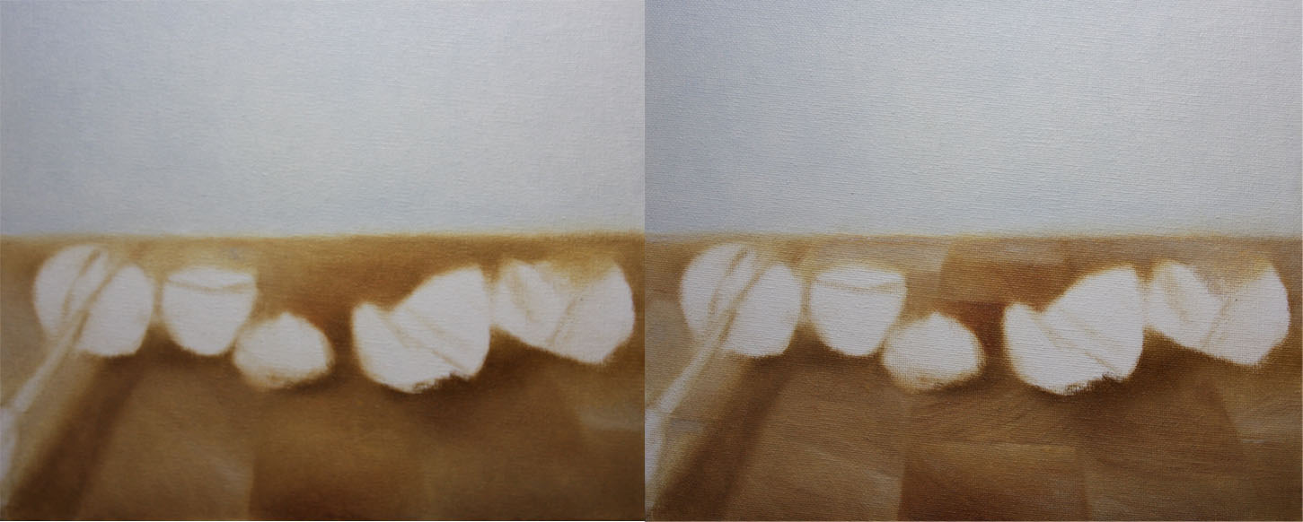
I wanted to create an interesting composition with some story mixed into it.  Limes are neat in shape their colors are pretty subtle too, its hard just to paint one in a frame you have to mix more into it.  I wanted to mix a whole bunch of them in one painting and create a story, it was fun playing around with this composition and then paint it.  The cutting board was another factor that played with this composition, its details and designs I believe works well with the overall painting.      
I started with just a dry brush approach using no mediums and just a bit of raw umber on the brush.  Once the drawing was complete I stated the background and the general colors of the wooden board.
Then with the wooden board I stated more of the general value shifts, at this stage I'm not worried about details just the general statement.  Then I added lighter values and its specific forms, I start to concentrate a bit more on details at this stage.
Then I add the general colors and big form modeling to the limes, I'm working on all the limes at once with each stage.  Then I added the darker values and its specific forms which insinuate more big form modeling. 
Then I add lighter values and highlights with its specific forms to take it to a finish.  As stated before I worked on all the limes at the same time with each value stage.  I hope you enjoyed this one, thanks for stopping by and viewing!


Saturday, April 23, 2011

"Fruit Tart"

Sold
"Fruit Tart"
6 x 6 in
Oil on Canvas Panel
Hi everyone first I wanted to let you guys know I'll be giving a demo on Wednesday, April 27 at Blick art material store in Edina.  If you'r around the area you should drop by I will be there from 1-4, this is for the 100th anniversary of being open.  There'll be live music and also great food, I might be to distracted to paint with all the food. 
This is another attempt to paint these delicious treats, I had to do this one because of the kiwi's and strawberries mixed into the usual group.  The colors and textures made it so much fun to try to paint, its always great to push yourself and achieve textures you'r not familiar painting.  There's also a lot of subtle value shifts in the body of the fruit tart, its great practicing these techniques it sharpens your skills in many ways.  Needless to say I enjoyed every bite when completing the painting, it's always a great incentive to finish.
I started with the usual dry brush approach using no mediums and just a bit of raw umber on the brush.  When the drawing is complete I start on the raspberries just stating the local colors first.
Then I apply the darker values and when thats complete I add the lighter values as well.
I repeat the same process with the right side of the fruit tart where the strawberries and raspberries are at.
When that section is done I start on the body of the fruit tart, stating the main colors first going from light to dark.  
Then I apply the darker values and take it to a finish and do the same with the lighter values.  Then I add the cast shadows and background giving more of a finish look to the painting, this sets up the final touches needed in the middle part of the fruit tart.  When adding the background and cast shadows I'm being aware of edges and how soft I need to take them in order for them to recede. 
Then I start on the kiwi's stating the local colors first, when thats complete I introduce a bit of middle to darker values showing how light travels across the form.
Then I add the lighter values to the kiwi's and take them to a finish.  Then I start on the blue berries and just state the local colors again, the same as I did with the kiwi's.
Since blue berries are just basically two tones, it's an easy fruit to complete very quickly.  Then I start on the last section of the fruit tart, again stating the local colors first and getting the general statement of light  wrapping around the form. 
Then I add the lighter and darker values and took it to a finish.  With this painting I was still concentrated on bigger and smaller form modeling, I expedited the process by just stating local colors and painting the darker and lighter values which is basically the same thing.  By just simplifying this process one gets to see how simple you can render with the paints and push the values in each direction.  I hope you enjoyed this one, thanks for stopping by and viewing!