Wednesday, February 22, 2012

"Senior"

Contact me if interested in purchasing
"Senior"
8 x 6 in 
Ball Point Pen
I've always loved drawing it was my introduction into this crazy art world and always find refuge when I need to escape it all.  I especially love drawing in ball point pen rather than any other medium, there's something about its permanent quality that attracts me and motivates me to fully concentrate with every mark I make.    I saw this picture in a publication a while ago and was immediately drawing to the simplification of tones and beautiful textures in the skin.  Not really into politics to make this drawing a political statement, just wanted to try to render it the best that I can.  Needless to say this is not an alla prima drawing, it took more than a day to complete I actually did not jot down the specifics on how long it took, it did take me a while though.  I hope you enjoyed this one!  
Detail.  

Monday, February 13, 2012

"Black Grapes"

"Black Grapes"
6 x 6 in
Oil on Canvas Panel
These grapes were so much fun to paint, I've mentioned before that I love painting textures and these grapes and wooden board delivered.  I tried my best to get a great picture without the grain of the canvas coming through and this is the best I can do.  Normally you cannot see the grains when looking at the painting but the way the natural light was hitting the canvas the camera picked up more than usual.  I also mentioned in other posts that one my idols in painting is Norman Rockwell, I just love all his paintings.  The way he painted light and texture is purely amazing, over the weekend I was studying a lot of his paintings I just can't get enough.  I saw one of his books at this great book store and its huge!  I think I might buy the book the quality and reproductions are great, seeing the paintings with its texture is purely delicious.  I find that bigger the book the better the quality is and one is able to observe in an intimate level.  As you can tell my addiction to books is beyond help, I find they teach us so much if we observe properly to what the artist is communicating.  
This is the start of the painting as you can see I am working with natural light which I believe is the best way to paint from.
Picture of the finished painting next to the setup, thanks for stopping by and viewing!


Tuesday, February 7, 2012

"Lemon Plums"

"Lemon Plums"
6 x 6 in
Oil on Canvas Panel
These lemon plums caught my eye in the grocery store I could not get my eyes off of them.  They are unique looking to say the least and you know automatically I have to paint it.  I really like their colors and how orange their tips are.  Along with the colors I enjoy their textures, they are subtle but painting the smooth to rougher texture in one plane was a nice challenge.
I wanted to remind everyone that I am doing a painting demo this Thursday at Dick Blick in Edina, Minnesota from 10:45 to 2:00pm.  I hope to see you guys there! 
I started with the usual dry brush approach for the drawing stage.  Once the drawing is complete I stated the big form modeling with a very thin mixture on the brush, its a dry brush approach as well.  
I then just concentrate on the darker values with their specific forms.  Once thats completed I move onto the lighter forms and continue the same process.
I repeat the same process on the second lemon plum till its completed.    
Once the plums are complete I state the wooden base by applying a thin coat for the base.  Going back to the plums you can see that I start really thin with my mixture, this allows me to control my values from the brush touching the canvas.  Think of it as rendering with a pencil, once you put the pencil to the paper to get the subtle rendering you need to have a soft touch, same idea.  When I need the colors or values to be stronger and more opaque I'll go thicker with the paints, but I do so in a slow manner making sure the transitions are working within each other.  
Then I paint in the darker values with their specific forms and do the same with the lighter values.  
Once the wooden base is complete I start on the background, in this stage I make sure to take my time in polishing all the edges.  Thanks for stopping and viewing, hope you enjoyed!


Saturday, February 4, 2012

"Italian Sundae"

"Italian Sundae"
8 x 6 in
Oil on Canvas Panel
I wanted to take a break from painting fruits and vegetables, figured this dessert was a good start.  I really enjoy passing the bakery isle in the grocery store it has so many goodies that are just great to look and eat at.  Out of the many times that i've passed it this time I could not walk away from this italian sundae.  From the presentation to the way the cherry just sits on top, almost like a bow sitting on a perfectly wrapped present.  To paint this dessert without eating it first was a challenge to say the least, temptation should of been the title to this painting.  
I started with the drawing stage by using a bit of raw umber on the brush and no mediums.  Once the drawing is complete I started with the cherry and cream part, I first painted the middle to darker values.  I start pretty thin at this stage to judge what type of texture I'm going for.  If it's a glossy look I want to put more paint on, if its a rougher feel I'm going for then I want minimal paint to start with.  Each section and area will have a different look and texture to them, the key is trying to figure it out with your brush.  
Then I painted in the lighter values and brought the area to a finish.  It's important to understand I don't move from an area until its completed, I put all my concentration to get it right in that stage so I don't have to go back.  I then move onto to the chocolate and cream area, first I lay in the middle to darker values.  Since this section is pretty soft in texture I want to start out with thin paints, I start out by laying my strokes very light in pressure almost like how one would draw with a pencil.  I like to slowly build to the texture and value I'm going for, I don't like to put the strong highlight or really deep dark first.  I prefer to gradually build the values first this allows me to control the transitions and textures.
Then I paint the darker darks and add more of the smaller form details.  After that stage is complete I paint the lighter values and bring this section to a finish.
 
I continue the process with the chocolate covered waffle top.  First just laying a thin application of paint to cover the areas I want it to be real thin and go a bit thicker where I want more contrast and focus.  Then I painted the darker darks with their specific forms, still being conscious of the pressure and amount of paint I'm using.  
I then brought this section to a finish by adding the lighter values.  For the bottom half of the waffle cone I repeated the process, this time I laid in a general color and did not go as thin as I was.  Since there's gonna be intricate lines I need a good base to paint on top of.  The paints I stated in this stage was to show how the light was moving across the form in a subtle way.
Then I added the middle to darker values with their specific forms, and did the same with the lighter values.  This area was tricky to paint because of the lines and how easy it can flatten the whole form if done wrong.  That's why I preferred to paint a base of the general color first so I can have the lines blending with the base in certain areas, it's easier to have it work with the overall form having the base there.
After that section was complete I stated the background and base, as you can see I added some of the chocolate chips on the base as well.  There's another topic I wanted to discuss with this painting that I was attentive from the beginning to end, it is "Edges".  Edges as I've mentioned before make or break your painting, from the outer edges of the subject or figure your painting to the edges within the brush strokes.  Having a soft and subtle edge from the beginning of laying the paints down can give me a soft look, I can then have a crispier edge in other areas which would create a great focus.  Experiment as much as you can with its properties and see how far you can push your paintings with it.  I hope you enjoyed this delicious dessert painting, thanks for stopping by and viewing.


Thursday, February 2, 2012

"Blood Oranges II"

"Blood Oranges II"
6 x 8 in 
Oil on Canvas Panel
Today I wanted to paint these beautiful blood oranges again but this time with a red cloth.  As I've mentioned in previous posts I really enjoy trying to capture the texture of things, today was definitely one of those days were it tested my abilities to do so.  From the wrinkles of the cloth to the soft subtle tones in the oranges and to the grainy wooden board.  All of them unique in their own way but meshing well together.  I was also able to mix my older approach to my new one of course shifting things here and there, for the most part I was pleased the way they worked together.    
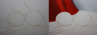
I started with the usual dry brush approach just using a bit of raw umber on the brush and no mediums.  Once the drawing was established I painted the background and the back section of the red cloth.  The colors I used for the background were ultramarine blue, titanium white and naples yellow.  For the red cloth I used naphthol red, cad. red, raw umber and ivory black.  When working in the cloth section I start by just laying in the values with their appropriate colors to match the hue.  I keep the transitions soft and make sure to not have any hard edges, this is my beginning layer and want to keep it as thin as possible.  
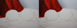
Then I start by adding the darker values and their specific forms, by doing this I start sculpting into the initial layer.  Once the darker forms are about complete I then paint in the lighter values with their specific forms.  By now I start to see the section coming to a completion, I start going back and forth from the darker values and pushing it to compliment the lighter values.  
Then I repeat the same process with the red cloth in the middle ground.
Once that section is complete I then move onto the first blood orange.  I start by painting the big form modeling in which the light is wrapping around the form.  Laying in a close approximation were each value scale should go with the right chroma to compliment it.  I also make sure to keep this stage of the painting thin, making sure the form is turning and it looks dimensional.  The colors I used for this section were cad.orange, cad.yellow pale hue, naphthol red, raw umber and ivory black. 
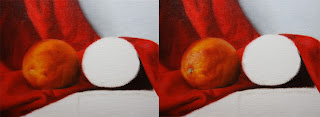
Once the big form modeling is complete I start to state middle to darker values with their specific forms.  When adding the smaller forms in this section I am able to use the initial layer that I stated in the big form modeling stage, this helps my blends go smoother and quicker it keeps a unified look.  It also allows me to go thicker and textured if desired to do so, it gives me the control i'm looking for within each section.  Once that section is about complete I start on the lighter values and highlights.  By the time I get to the end of this stage I am able to go back to the previous section,  I alter some values and chroma's that I didn't notice when the lighter values were not painted.
I repeat the same process with the second blood orange.
Once the blood oranges are complete I then start on the on the wooden board.  First painting the fall of light by keeping the values and colors generalized.  At this stage i'm not looking for details just a generalized information of the light and color.  I also make sure to keep this stage as thin as I can, doing so makes it easier to build layers and keep control.  The colors I used for this stage were raw umber, titanium white, ultramarine blue, cad.orange, and ivory black.
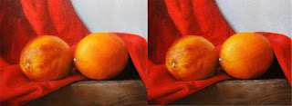
Then I paint in the middle to darker values with their specific forms, I start narrowing in the smaller forms by adding its specific characteristic.  I do the same when adding the lighter values and highlights.  After this stage is complete I go back around and see if I need to push anything or if I've missed a certain part.  I go back into the background and grey it down a bit, I thought it was competing with the foreground for the most part.  Well this painting definitely was a longer one to explain with each of its intricate sections.  It was so much fun painting them and also being able to explain each section, thank you for stopping by and viewing.