Thursday, July 28, 2011

"Cherries & Marble"

Sold
"Cherries & Marble"
5 x 7 in
Oil on Canvas Panel
Cherries on marble have a great look to it I was beyond excited to get this painting started when I paired them up.  The slick smooth surface on the cherries I think meshes well with the rough textures on the marble, I also like the shine on the cherries.  As stated before painting marble is very challenging but glad I keep doing it because it teaches me something new every time.  Looking at these cherries for such a long time while painting them was torture for not being able to eat them, needless to say when I finished painting them I enjoyed every bite of it. 
I started with the usual dry brush approach using no mediums and a bit of raw umber on the brush, then I  stated the background and middle value to the base.  I keep the paint fairly thin at this stage this allows me to control the values from the beginning.  Then I start on the front part of the marble just concentrating on the middle to darker values first, I don't just paint the darkest darks first I slowly build up to it.  The colors I used where cerulean blue, ultramarine blue, titanium white, naples yellow, and ivory black.
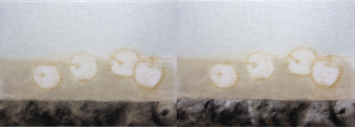
Once the middle values where working and had a map of where to put the darker darks I then stated the darkest values and their specific forms.  Once that was complete I stated the middle to lighter values, I repeat the same process as I did when starting to state the middle darker values.   I like to slowly progress to the lightest and darkest values this allows me to control the blending and textures I'm going for.
I repeat the same process for the top of the marble.
Then I start cherries all at once just stating the middle values, I like to lay in all the general colors in the cherries at this stage.  Once thats complete I start on the first cherry stating the middle darker values and building up to the darker values with their specific forms.  Then I start on the middle to lighter values and  progress to the lighter values with their specific values.  The colors I used for the cherries are alizarine crimson, cad. red light, cad. yellow light, and ivory black.
I repeat the same process with the second cherry.
And do the same with the third and forth cherry.
Then I completed the fourth cherry then went back into the marble and took the cast shadows to a finish. As stated before its very challenging to paint marble and glad I did so, I learn so much every time I paint it.  I recommend anybody who wants to learn how to render different types of textures in one plain should definitely paint marble, its a great learning experience.  I hope you guys enjoyed this one, thanks for stopping by and viewing!


Tuesday, July 26, 2011

"Black Plums 2"

"Black Plums 2"
8 x 10 in 
Oil on Canvas Panel
I wanted to continue the marble series with another painting of these beautiful plums, especially painting marble practice makes perfect.  I noticed with painting plums you have to be very delicate with each transition of tones, which is stark contrast with marble.  Marble has so much texture their are subtle value shifts but for the most part its rough with impasto strokes.  I always start with the marble section first it requires so much attention, it takes so long to get the subtle and rough strokes working right with each other.  I suggest anybody who wants a great challenge on how to paint textures with so many properties should paint marble.  
I wanted to remind everyone again that I will be giving a live demo at the Uptown Art Fair, it'll be on August 5 from 1-5 p.m.  It'll be great to see you guys there!  I will also be teaching a still life and figure drawing workshops at the Bloomington Art Center, if anyone's interested you can now sign up for the classes.  Click here to see sign up!
I started with the usual dry brush approach using no mediums and a bit of raw umber on the brush.  Once the drawing is complete I stated the background and marble, I used cerulean blue, naples yellow and titanium white.  For the marble I just painted a thin base of the middle value, I used titanium white, ivory black, yellow ochre and raw umber.
Then I stated the middle darker values first not going to dark first, I like to slowly build up to my values. The middle picture shows the darker values taken to completion, then the third picture shows the lighter values and its specific forms taken to completion.  I made sure in each stage I take it to a close completion, the reason I'm not able to finish it is when stating surrounding values it effects the values that  have been painted before.  When all the values are stated in the end thats when you can fully see what you have and shift values here and there to the look your going for.
I do the same process with the top of the marble.
Then I start with plums after the marble is complete, I state all the plums with the middle values first.  Then I start with the first plum on the left stating the darks and its specific forms, for the most part I'm making the form turn at this stage and adding any details relating to the darks.  I used ivory black, alizarine crimson, and napthol red.
When the darks are complete I start with the lighter values and its specific forms, the colors I used where cerulean blue,  and titanium white.  Once the first plum is complete I repeat the process with the second plum, I also use the same colors as I did with the first plum.
And do the same with the third plum.
Once the plums are complete I went back to the cast shadows of the plums and filled in the darks, this allows the plums and marble to be in the same plane.  I also lightened some areas of the marble and took the whole painting to a finish.  I think after painting marble so many times I can paint it with my eyes closed, I'm glad i'm doing it though it really pushes me and challenges me like never before.  I hope you guys have enjoyed this one as much as I did, thanks for stopping by and viewing!


Thursday, July 21, 2011

"Black Plums"

Sold
"Black Plums"
8 x 10 in
Oil on Canvas Panel
Plums have such a rich deep colors to them, what I especially love is the way light softens and wraps around them.  The marble I believe also adds a nice element to the subtle colors of the plums.  The more I paint marble the more I understand its textures and how to paint them.  These two components have different textures to them one being smooth and the other being rough, painting these two elements in one painting is a good way in learning how to manipulate the paints.  
I wanted to remind everyone again that I will be giving a live demo at the Uptown Art Fair, it'll be on August 5 from 1-5 p.m.  It'll be great to see you guys there!  I will also be teaching a still life and figure drawing workshops at the Bloomington Art Center, if anyone's interested you can now sign up for the classes.  Click here to see sign up!
I started with the usual dry brush using no mediums and just a bit of raw umber on the brush.  After the drawing is complete I stated the background and also the middle value of the marble.  The colors I used at this stage is cerulean blue, naples yellow and titanium white.  For the marble I used ivory black, titanium white and raw umber.  I keep the paints really thin at this stage, this acts as a base for thicker paint to flow easier up top.
Then I start on the bottom part of the base first stating the middle darker values first, I like to slowly build up to the darks and do the same with the lights.  Then I start to add the darker values and its specific forms, when thats complete I move on to the lighter values and take it to a finish.  I make sure with each of these stages that I take them to a close finish, this allows me to completely concentrate on each area and take it to a finish.  
I repeat the same process on the top of the marble as I did with the bottom.  As you can see with the first picture I state the middle values first, I keep the edges really soft and the paints really thin.  This allows me to slowly build up the edges I want and certain looks I'm going for.
Then I apply a thin coat of a middle value to all the plums in one shot, this as stated before acts like a base so the paints can flow easier and smoother.  The colors I used where alizarine crimson and ivory black.  Then I start on the first plum and completely concentrate on that one until I take it to a completion.  I start on the darker values first and its specific forms, I use ivory black for this stage.  
Then I add the lighter values and its specific forms, I use titanium white and cobalt blue for this stage.  Then I start on the middle plum when the first one is complete and repeat the same process.  With the darkest and lightest value stages I'm starting out with a middle value and building up to the values I'm wanting, I never start with the brightest or darkest values first and model it from there.  I think of it as if I was drawing with a pencil you want to gradually build up to your tones, this allows you to create subtle transitions.  When the transitions are becoming subtle and shifting then I start to see if I want to add thicker paint to get a harder edge or keep them soft with thinner paint, the important part is that I'm gradually arriving to that stage not jumping straight to it.
 I do the same with the third plum after the second plum is complete, I also use the same colors through out all the plums.
I take the painting to a finish after I go back to the cast shadows where marble meets the plums and add darker values which meshes the plums and marble together.  I really enjoyed painting these plums, painting these two surfaces was more fun than what I expected.  I also enjoyed going back to the fundamentals of finishing an area before moving onto the next.  I've noticed in past paintings I have the habit of going really fast and jumping around the whole painting, I wasn't concentrating in one section at a time.  To me thats crucial in really observing what you'r painting and also painting what you see to your best ability.  I noticed that when I jump around in the section I'm painting without a methodical plan it takes me longer than painting it in stages like I did with this one.  I hope you guys enjoyed this one as much as I did, thanks for stopping by and viewing!


Tuesday, July 19, 2011

"Red Grapes"

Sold
"Red Grapes"
8 x 10 in
Oil on Canvas Panel
I'm so happy to stay in and paint all day the weather out here is scorching HOT, it got to be 113 degrees fahrenheit with the heat index.  Even in the studio painting it got to be a little warm, its crazy to think that Minneapolis gets so cold in the winter and in the summer it gets unbearably hot.  As stated before I've been extremely busy with other paintings and teaching, I do miss painting these alla prima's and enjoy every moment I have when i'm able to do so.  I wanted to continue the theme of painting grapes on this beautiful marble piece, this time I introduced red grapes into the mix.  Red grapes have such beautiful textures to them, the soft lighting that wraps around the grapes and deep rich colors makes it enjoyable to paint.  
I also wanted to remind everyone that I will be giving a live demo at the Uptown Art Fair, it will be on August 5 from 1-5 p.m.  It'll be great to see you guys there!  I will also be teaching a still life and figure drawing workshops at the Bloomington Art Center, if anyone's interested you can now sign up for the classes.  Click here to see sign up!
I started with the usual dry brush approach for the drawing stage, when that was completed I stated the background and base.  The colors I used where cerulean blue, naples yellow, titanium white those where for the background.  For the base I used ivory black, titanium white, raw umber, and yellow ochre.  At this stage I'm just stating the middle values first to create a base I can work from, this allows me to go lighter or darker without getting muddy.  I never start with my darkest darks and lightest lights in the initial stages, I like to build up to my final values.
After the middle values are stated I start to paint the darker values, I do this first because it allows me to see how light I need to go with my lights.  After the darks are completed I state the lighter values and take the marble to a close finish.
I then start on the grapes stating the middle values first as I did with the marble, the colors I used are alizarin crimson, cad. yellow and burnt umber.  I also add the stem at the same time using cad. yellow and raw umber.  Then I add the darker values and their specific forms using ivory black, and burnt umber.
After the darker values are stated I add a bit of middle lighter values and start to form each grape to their specific forms.  Then I start adding more of the lighter values and their specific forms after the darker values are stated.  I take the grapes to a finish and add the finishing touches to the marble.  Needless to say after painting these guys I enjoyed eating every one of them, I then stuck my head in the freezer and cooled off from the very hot day of painting.  Thanks for stopping and viewing, I hope you enjoyed this one as much as I did!


Thursday, July 14, 2011

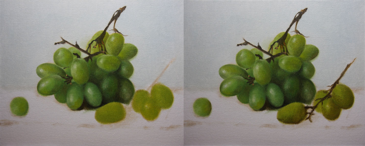
"Grapes & Marble"

Sold
"Grapes & Marble"
8 x 10 in
Oil on Canvas Panel
I first want to apologize for not posting on a regular basis to the hardcore daily painters, i've been beyond busy from vacation and trying to get back on schedule.  It felt good today to get back into the routine of doing an alla prima it's been to long and well needed, that's one of the reasons I don't like going on vacation for a long period of time it gets me out of my rhythm with painting.  I must say this painting was  bit daunting to do in one session especially for not painting for a while.  These green grapes are delicious to paint they have such beautiful deep yellow green colors, when contrasted with the marble it shines on its own.  The marble is a whole painting in its self its textures are fun to paint, going really thick in impasto for the highlights where to much fun.  I have to say painting flowers for such a long time has prepared me for anything when it comes to textures, although marble did throw a curve ball to the mix.
I also wanted let everyone know if you'r in Minneapolis on August 5 you should stop by at the Uptown Art Fair.  I will be doing a still life demo from 1-5 p.m. I'll be at the corner of Lake and Hennepin, hope to see you guys there!
I started with the usual dry brush approach for the drawing stage using no mediums and a bit of raw umber on the brush.  After the drawing is complete I stated the background using a cerulean blue, naples yellow and titanium white.  
Then I stated the general colors for all the grapes I make sure not to add the extreme of both values.  Then I start adding slowly the darker values and its specific forms, the colors used are viridian, ultramarine blue, cad. yellow light, and raw umber.
Then I add the highlights and their specific forms and also the extreme darks for some accents, once that area is complete I move onto the other set of grapes.  I repeat the same process as I did with the previous grapes.
Then I add the highlights and their specific forms and take those grapes to a close finish, I know when I add the marble I have to go back into the grapes and tweak certain areas for the finish.  I add the middle values for the marble area I'm not interested in details at this stage.  I use titanium white, ivory black and raw umber.
Then I added the darker and lighter values and its specific forms, the lighter values where so much fun to paint going really thick in impasto made it feel as if I was sculpting with the brush.  As stated before I didn't think painting marble would of been so challenging but I learned a lot from it.  When the marble is complete I go back into the grapes and just tweak certain areas and take the whole painting to a finish.  Glad to have finished and get back to the routine of painting these gems, looking forward to the next one.  Thanks for stopping by and viewing hope you enjoyed this one!


Saturday, July 9, 2011

"Key Biscayne"

"Key Biscayne"
8 x 10 in
Oil on Canvas Panel
Hi everyone I apologize for the long absence I've been visiting family for my birthday in south Florida, I've been on vacation for over a week and have been itching to get back to painting.  I did this painting on the beach yesterday it was a lot of fun to paint, I know my strongest point is not landscape painting but its something I respect and would love to dabble more in the future.  It's been really nice visiting family being together with my parents is something i've been needing for a while, it saddens me to leave and get back to the real world.  Funny story while painting this picture it was a bit of overcast seeing how cloudy it was I didn't think of putting any sunblock, not a good idea I ended with my legs really burnt and my neck as well.  The sun here gets worst by the years I definitely learned my lesson and hope next time to at least put some sunscreen no matter how cloudy it is.  I leave back to Minneapolis this evening I hope to blog more when I arrive this week.  Thanks for stopping by hope you enjoyed this one!
This is a photo of the set up and a great view of the beach.


Tuesday, June 28, 2011

"Ranunculus 2"

Sold
"Ranunculus 2"
8 x 10 in
Oil on Canvas Panel
I wanted to paint another version of these beautiful flowers, as stated in previous post these guys remind me of peonies thus the reason I like painting them.  I've been so busy lately doing other paintings its always good to come back to these alla prima's and have a fresh eye.  I believe doing alla prima paintings are essential for painters, it keeps you fresh and allows you to experiment with your own technique.  I've been painting flowers for a good while now I have to say its taught me a lot with my own approach to painting.  Flowers have an abstract shape to them to me thats what makes them so beautiful, once you think of them as abstract shapes then it becomes easier to paint.  What I like about these ranunculus it seems as if the lights radiating from the middle of the flower, it's all in the coloring of the flower and how its dispersed through out its body.  It's amazing how mother nature conjured up all these wonderful flowers.
I started with usual dry brush approach using no mediums and a bit of raw umber on the brush, I didn't want to get to detailed since I'll be adding most of the flowers in the later stages.  After the drawing stage is complete I stated the general colors with middle values, I don't want to add highlights or darker values just a a general statement.  The colors I used for this stage is titanium white, quinacridone magenta, naphthol red, viridian, and raw umber.
Then I added the background using yellow ochre, ultramarine blue, and titanium white.  Adding the background at this stage allows me to get a general feel of the colors.  I can now start adding darker values and their specific forms with the first batch of flowers.  The colors I used are ivory black, raw umber, and ultramarine blue.
Then I add lighter values and their specific forms, the colors I used for this stage is titanium white, quinacridone magenta, and naphthol red.  Once thats completed I start on the other section of flowers and repeat the same process.  I also use the same colors as I did before, I start adding middle and darker values and their specific forms.
Then I add lighter values and their specific forms.  I'm constantly going back and forth between values and adjusting them to the right look, this always happens when adding a new value.  Once the flowers are taken to a close finish I start on the stems and vase, I start on the middle to darker values and their specific forms.
Then I add the lighter values and their specific forms and take it to a finish, I then go back to the flowers and tweak some highlights and darker values.  Once I've taken the flowers to a finish I take the painting to a completion.  As stated before in the beginning I truly do love painting flowers they teach me so much about painting and its textures, it's great practice overall and enjoy every second of it.  I hope you enjoyed this one as much as I did.  Thanks for stopping by and viewing!


Friday, June 24, 2011

"Ranunculus"

Sold
"Ranunculus"
10 x 8 in
Oil on Canvas Panel
Todays alla prima painting is of ranunculus, these beautiful flowers resemble peonies to me even though I know there not.  I went to my favorite coffee place in town and met up with a couple friends which I'm glad I did because I ran into these beautiful flowers.  They were sitting right on my table and instantaneously I fell in love, the movement within the petals and rich colors made it more of a reason to paint.  I thought I was going to be done with painting flowers for a while and suddenly changed course again after seeing these beautiful flowers.  That's one of the reasons why I love doing these alla prima's, you never know what your next painting might be and if you do it can change in a split second.  Inspiration comes from everything I see and what moves me is what I enjoy painting the most, I hope you enjoy this one as much as I did.
I also wanted to let you guys know that I've finally published the video of the portrait demo I did at dick blick last Saturday, thank you to everyone that was able to show up I greatly appreciate it and had a lot of fun.  I have the video on youtube you can see it by clicking here.  
I started with the usual dry brush approach using no mediums and a bit of raw umber on the brush, again not spending to much time on the inside of the drawing just stating the general shapes.  After the drawing is complete I start on the background the colors I used are ultramarine blue, naples yellow and titanium white.
After the background is complete I state the general colors and keep all the edges soft, I'm not concerned with details or the darkest values just the general statement of colors.  I keep the paints really thin at this stage this creates a base for when I put more paint it'll glide easier and blend better.  Then I state the darker and middle values and their specific forms, I start narrowing down the shapes at this stage still keeping the edges soft and subtle.  The colors I use at this stage are quinacridone magenta, viridian, cad. yellow, titanium white and ultramarine blue.
Once the darker and middle values are close to completion I start on the lighter values and their specific forms, I'm able to take the whole section of the flowers to a finish when painting this stage in.  I'm constantly going back and forth between values and adjusting them to their specific look that's why I get to a close finish with the darker values, when I paint the lighter values I can really take the whole area to a finish.  After the flower section is complete I start on the vase and also darken a bit of the lower section of the background to have more of a fall of light.
I sharpen a bit of the edges on the vase and add highlights which brings that section to a finish, then I go back to the flower and tweak certain highlights and shadows.  I'm glad I was able to run into these flowers today and paint them, I had fun doing so and learned something new.  I hope you enjoyed this one, thanks for stopping by and viewing!


Tuesday, June 21, 2011

"Peonies Fuchsia"

Sold
"Peonies Fuchsia"
8 x 10 in
Oil on Canvas Panel
I've been wanting to paint just fuchsia peonies and glad I did so, they have so deep colors within them I wish I had all the colors in the spectrum to render their beauty.  As stated in my other posts about peonies they are not easy to paint and especially when painting with the color fuchsia, you have to be careful in the way you apply lighter colors to the mix.  Peonies have such beautiful textures to them thats one of the main things I enjoyed the most about them, playing around with the brush and experimenting to see what kind of textures you can get is beyond fun.  With this painting I also decided to paint some baby peonies, they look so neat from there beginning stages all curled up and when they blossom they are even more beautiful.  To have baby peonies together with the full blossom ones gives a nice feel to the overall painting.
I started with the usual dry brush approach using a bit of raw umber on the brush just to get the main placement of the drawing down.  I was not concerned rendering every petal at this stage I wanted to just concentrate on the overall composition and how sat within the canvas, later I'll be able to render the peonies to finish when the base is applied.  After the drawing is complete I stated all the colors at once from the background to the stems and peonies, reason I did that is to have a general feel of the painting.  When working on such an intricate composition and there's so much going on its good to see the color harmony between each object.  I keep the paints thin at this stage I try not to get to thick, keeping the paints thin creates a base so I can easily maneuver around with my darks and lights in the later stages.  The colors I used are quinacridone magenta for the peonies, ultramarine blue and cad. yellow for the leaves and stem, and ultramarine blue and naples yellow for the background. 
After the general statement stage I move on to modeling the forms with the peonies, I make sure not to go to dark at this stage just to get the form turning in a subtle way.  The colors I use to mix with the peonies to turn the form is ultramarine blue and ivory black.  Then I start adding the darker values and its specific forms using the same colors as stated before.
Then I added the lighter values and its specific forms, at this stage I'm bouncing back and forth between values and adjusting them to the right look.  The colors I used for this stage is titanium white, naphthol red and quinacridone magenta.  After the top peonies are close to completion I them start on the bottom ones, I first add the darker values and its specific forms as I did with the previous stage.  I'm using the same colors as I did with the other peonies.
Then I add lighter values and its specific forms and take them to a close finish, again using the same colors as I did with the top peonies.  Then I work on the leaves and stems, I start to emphasize the darker values and its specific forms.  The colors I used in this stage were ultramarine blue, viridian, yellow ochre, cad. yellow pale.  After finishing the leaves I then went around all over and started softening edges, doing this effect pushed some peonies further back and in turn left the other peonies in focus.  I know I've said it in the past how important it is to soften edges and keep some sharper, but I cannot stress it enough.  Edges can make or break you'r painting its vital to understand them and pay close attention to them.  With my initial stages I like to keep all the edges soft this allows me to gradually build up in values and keep the form turning.  The later stages I start to add sharper edges to show more focus or where I want your eye to lead.  Edges are important in many ways they are fundamental from rendering and turning the forms to finishing the last touches in you'r painting, never lose sight of them and experiment as much as you can with them.  Thanks for stopping by and viewing, I hope you enjoyed this one!