Tuesday, November 29, 2011

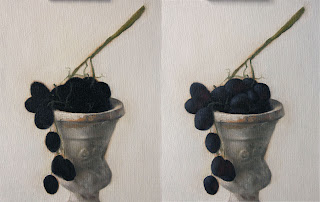
"Grapes & Wine Glass"

Sold
"Grapes & Wine Glass"
7 x 5 in 
Oil on Canvas Panel

Thanksgiving was so well needed the amount of food I ate was just ridiculous but I look forward to it.  Relaxing and being with family is always a nice thing to do, I wasn't able to work on any paintings but did have the chance to finish up some drawings.  I was itching to get back to painting after lounging around and not really doing anything, its nice to relax but to much of it can throw me out of sync. 

 I truly do love painting grapes from their texture to the colors that are deep within their skin, I can't find a bad thing about them.  What I also like about them is that their stem always has a gestural feel to it, its in charge of holding together all these little guys and maintaining a balance with their weight.  As mentioned before their texture is really beautiful to paint, their skin is able to absorb light and retain it with a glowing effect.  Light skims across their form and ever so lightly wraps around it, it's really neat to see the difference between each of them.  I wanted to continue the play with composition that I've been doing lately and introduce a wine glass to the picture, I felt it was fitting to incorporate it with the grapes and also have an opportunity to paint a shiny surface.  As beautiful as they were to paint they were even more delicious to eat afterwards, nothing beats painting one of these and eating them as a reward for being done.

I have exciting news I've been recently picked up by Art Resource Gallery in Edina, Minnesota.  I started showing their last weekend, I'll only be showing larger still life paintings and ball point pen drawings.  If anybody is in the neighborhood you should stop by and check out the artwork.  I also have two new classes at Bloomington Art Center that are being offered for the winter session.  If anyone is interested you can sign up by clicking here for the figure drawing class and here for the oil painting class.   

I started with the usual dry brush approach using no mediums and a bit of raw umber on the brush.  Once the drawing was complete I filled the background in with titanium white, ultramarine blue and cad.red light.  After the background was complete I stated the grapes and their big form modeling, I'm not really concerned with the details at this point just on how the light falls on the form and how dark the darks need to be.  The colors I used for this stage were naphthol red, cad.red light, cad.yellow light, cad. orange and ultramarine blue.   

Once the big form modeling was stated I then start to concentrate on the small form modeling stage, I break this stage down to two sections first stating the darker values with their specific forms.  Once that's complete I start on the second section which is stating the lighter values with their specific forms and highlights.  The reason I like to break this stage down to two sections and start with the darker values first, it lets me see how dark I need to really go and sets up the lighter values for the finish.  It keeps the process controlled it's really easy to just work all around and not really get to a finish, doing it in this manner really allows me to get a quicker finish in a methodical way.

Once the grapes and stem are taken to a close finish I then start on the wine glass by stating the middle to darker values first.  Once thats complete I then state the lighter values and their highlights.  Once I'm finished with the wine glass I can then go back to the grapes and add any finishing touches.  That's the reason I stated that I take the grapes and stem to a close finish because once all the elements are painted you get a better picture on how everything works together, you'r bound to change or add something towards the end.  

Thanks for stopping by and viewing everyone, hope you enjoyed this one!


Wednesday, November 23, 2011

"Follow the Leader"

Sold
"Follow the Leader"
8 x 10 in 
Oil on Canvas Panel
I wanted to continue painting these beautiful raspberries for another session, I really like the intense colors within the raspberries and their textures.  This time I wanted to incorporate the blue and red cloths I've painted in previous paintings, as they're challenging every time I paint them I was looking forward to them.  It's funny how each of these alla prima's I'm always finding out different ways to approach certain areas, there's some consistency in the approach but the execution can vary from one texture to the other.  That's the beauty of these little guys just when you think you've figure it out a new painting comes along and throws you in a twist.  I also want to wish everyone a Happy Thanksgiving and wish everyone the very best with their family and loved ones.  I'm excited to eat so much and not be able to move afterwards, nothing beats being with the family and eating to a point where you can't think straight.  Happy Thanksgiving everyone!
I started with the usual dry brush approach using no mediums and a bit of raw umber on the brush.  When the drawing is complete I stated the background and cloths, the colors I used for the background were ultramarine blue, naples yellow and titanium white.  For the blue cloth I used ultramarine blue, cobalt, and ivory black.  For the red cloth I used naphthol red, cad.red light, and ivory black.  When dealing with the cloths in the initial stages I laid down the fall of light with its general colors, I'm only worried about making the form turn and stating the shadow shapes.  I also make sure to leave my edges soft if your edges are hard it limits the form from turning, in later stages you can harden your edges to show texture or more contrast between forms.  In this stage I already added the shadow shapes and developed them to a further finish, I did the big form modeling and darker values stages together.
Then I add lighter values with their specific forms and bring the cloths to a finish.  After the cloths are complete I start on the raspberries by first state the general colors and after do big form modeling, I work on the red and black raspberries simultaneously.  
Then I add the lighter values with their specific forms and also re work some of the darker values to blend better with the overall form, after doing this it brings the whole painting to a finish.  It's nice to get one of these guys painted before the holiday hits, I know I'll be out of commission due to all the consumption of food.  Hopefully i'll be able to draw if i'm unable to move from the food coma!  Hope you enjoyed this one thanks for stopping by and viewing, Happy Thanksgiving! 


Monday, November 21, 2011

"Raspberries Aligned"

Sold
"Raspberries Aligned"
5 x 7 in 
Oil on Canvas Panel
I always have so much fun painting raspberries, their texture and intense colors make it a delight to paint.  I wanted to play more with the composition between the red and black raspberries.  When painting the red raspberries I noticed how intense the reds got, its pretty subtle on how strong those reds can be without going overboard.  The black raspberries absorbed it's surrounding colors, at times it did show some reflected lights, I believe these two compliment each other well.  One of the other reasons I like painting these guys is because I get to eat them right after I'm done, but let me tell you it's hard to fight the urge to do so while painting them.  Thanks for stopping by and viewing I hope you enjoyed this one!

Sunday, November 20, 2011

"Blue Tangerines 2"

"Blue Tangerines 2"
10 x 8 in
Oil on Canvas Panel
I wanted to do another painting of these tangerines and blue cloth, the last one I did really pushed me to my limits and I wanted another try at it.  I'm glad I did so because I really enjoyed the process.  It was hard for me to just paint this while seeing my girlfriend put up all the christmas ornaments and clean the apartment, I felt bad not helping but she knows how much I am addicted to painting and when I have the itch all I can do is just paint.  I really do appreciate her patience and letting me dive into my passion, she's truly one of a king, to say I'm the luckiest guy in the world is an understatement.  I still wanted to keep the play within the tangerines and have the blue cloth be a little separated.  Painting these two different textures have been a challenge to say the least but also has been an eye opener on how to handle my craft and adjust it to each painting.  I hope you guys have enjoyed this one thanks for stopping by and viewing.

Friday, November 18, 2011

"Blue Tangerines"

Sold
"Blue Tangerines"
10 x 8 in 
Oil on Canvas Panel
I wanted to challenge myself again with another try in painting this blue cloth, and challenging it was.  Blue is such a transparent color and to make it look finished in one session was very difficult.  I did like the concept of having these two elements together especially since their colors do clash.  I concentrated most of my time in the blue cloth and trying to get a good grasp of the technique.  
I started with the usual dry brush approach for the drawing stage, I have a bit of raw umber on the brush.  Once the drawing is complete I stated the background and blue cloth, the colors I used for the background were cobalt blue, naples yellow and titanium white.  For the general lay in of the blue cloth I used ultramarine blue, cobalt blue.
Then I stated the darker values and worked more with the big form modeling of the whole form, I used ivory black for the darker values.  Once the darker values were working I moved onto the lighter values by adding titanium white to cobalt blue.  
Once the cloth was finished I started on the tangerines working on both at the same time.  I first started with the general color lay in and then big form modeling, the colors I used were cad.orange, cad.yellow light, naphthol red, raw umber and ivory black.  After big form modeling I stated the darker values with their specific forms.
Then I stated the lighter values and highlights with their specific forms to bring the painting to a finish, the colors I used for this stage were mainly titanium white and cad.yellow light.  Now to go and eat these delicious tangerines!  Thanks for stopping by and viewing hope you enjoyed!


Wednesday, November 16, 2011

"Blue Eggplants"

Sold
"Blue Eggplants"
8 x 10 in 
Oil on Canvas Panel
It's good to be back painting after being out of town again, I went to go visit my girlfriends family in Utah.  It was so beautiful to go up to the mountains and relax, I wish I brought my paints although I know I wouldn't have time to paint.  I just returned and wanted to paint these baby eggplants with a blue cloth, I really like the combination of these two.  In comparison to painting the red cloth I do have to say the blue one is more challenging, I do like the challenge and hope to continue to incorporate this beautiful cloth in future paintings.  It's always rough to paint after not painting for a while but you have to get over that hump and get the wheels grinding.  I hope you guys enjoyed this one, thanks for stopping by and viewing!  

Wednesday, November 9, 2011

"Pear in Red"

Sold
"Pear in Red"
10 x 8 in 
Oil on Canvas Panel
I did this painting today in the middle of the million things I had to do, glad I did though I had so much fun with yesterdays painting I wanted to continue that today.  This time I actually painted a pear other than yesterdays painting looked like pear's.  I wanted to also have it in a black box to add more drama to the painting.  I always love the baroque paintings that implore these type of lighting compositions.  It was a challenge to paint such a dark background in one passage especially when it involves different elements that are mixed into it.  What I was striving for was having the pear be the central focus with the lighting and have the rest of the light shimmer across the red cloth.  I had a lot of fun painting this one especially that it was different than my normal alla prima's, I'm excited to see what else I can do with these type of compositions and lighting situation.  Till then thanks for stopping by, I hope you enjoyed this one!
Setup of my little still life with a make shift shadow box, using natural light as the main light source.

Tuesday, November 8, 2011

"Quince Pineapples"

Sold
"Quince Pineapples"
8 x 10 in 
Oil on Canvas Panel
These pear of unique pineapples I saw at the grocery store is something i've never seen before, I knew right away I had to paint them since their not the usual pineapples I'm used to.  I've been wanting to paint this red cloth for a while and thought pairing it up with these pineapples would be perfect.  Having to adjust to the daylight savings time has been a bit tricky to do, I have to start these paintings much earlier so I have sufficient natural light to paint with and to take pictures.  I haven't found anything that replaces using natural light it's the best source of light to use in order to have the purest colors.
I started with the usual dry brush approach using no mediums and a bit of raw umber on the brush.  Once the drawing is complete I stated the background and red cloth, with the red cloth I state the fall of light or how the light falls across the form.  The colors I used were ultramarine blue, naples yellow and titanium white.  The colors I used for the cloth were cad.red light, and ivory black.
Then I start to work on small form modeling by first stating the darker values with their specific forms. After the darker values are done I proceed to the lighter values and their highlights, for the lighter red areas I used a bit of cad.orange mixed with cad.red light.  After the cloth is complete I can then move onto the pineapples by concentrating on big form modeling, at this stage I'm just worried about stating the general colors and how light wraps around the form.
Once the form is turning and appears dimensional I can then start on small form modeling, at this stage I like to break it into two parts.  The first part starting with darker values and their specific forms and when thats complete I finish it off with the lighter values and their highlights with their specific forms.  The colors I used for the pineapples were viridian, cad.yellow light, titanium white, cad.red light, ivory black and ultramarine blue.  Painting cloth in a still life is something I've always enjoyed, one can learn so much by its folds and how color and light falls on each plane.  It compliments well whatever its paired with and I get a lot from the experience painting it.  I hope you enjoyed this one thanks for stopping by and viewing! 


Friday, November 4, 2011

"Black Grapes"

Sold
"Black Grapes"
10 x 8 in 
Oil on Canvas Panel
I wanted to try a different composition with these beautiful grapes, I pictured this setup in my mind when I was in the kitchen and when I put the two objects together I knew it was right.  There's something about the rustic old vase combined with the grapes that compliment each other really well.  I also like the subtle cool colors these two create, when working on the vase it was a challenge trying to recreate its textures.  Painting the grapes was so much fun from the darkest values to the lightest texture applied.  Grapes have so much beautiful little textures within them if captured correctly it'll push the painting to that next level.  Since the painting is done I can truly enjoy eating these delicious grapes! 
I wasn't going to do process photos with this one but then decided last second to do so, I've been so busy that I don't have time to do these process photos glad I did though it's been to long.  I also wanted to do them to celebrate the weekend being here, these last couple weeks have been really hectic with teaching and getting bigger paintings complete that doing these alla prima's have been tight on time to do.  I really do enjoy sharing my process and miss doing that although I did get used to just going from one stage to the other without stopping and taking photos, I caught myself doing that a couple times I had to slow down for the majority of this painting.  As stated before glad to have done the process photos, I hope in the future I'm able to do them on a consistent basis.
I started with a bit of raw umber on the brush for the drawing stage.  As you can see with the picture I erased a bit to change the proportion of the overall painting, I felt it would of sat better compositionally not being so large on the canvas.  Incase your wondering I erase with my fingers not with any solvents.
Once the drawing is complete I stated the background with ultramarine blue, naples yellow, and titanium white.  Once the background is stated I then start to fill in the rustic vase by laying in big form modeling with its general colors, I'm not worried about details at this point just how the light wraps around the form and it's general colors.  
Once big form modeling is complete I then move onto small form modeling, I first concentrate on the darks and state their specific forms also adding reflected lights to turn more of the form.  Then I start on the lighter values by adding their specific forms and finish it off by stating their highlights.  The colors I used for the vase were ivory black, titanium white, yellow ochre, ultramarine blue, cad.orange, and cad.red light. 
Once the vase is complete I move onto the black grapes and add its general color which is ivory black.  Since there are so many grapes and you can't just do big form modeling with all of them at once I just add black right away for a base, then I model each grape with its general light and color.  I also worked on the stem at the same time as I did the grapes.  The colors I used for the grapes were ivory black, ultramarine blue, cad.red light, and titanium white.  For the stem I used ultramarine blue, cad.yellow light, yellow ochre, ivory black and titanium white.
I leave the highlights towards the end to pop the painting and bring it to a finish.  I hope you guys have  a good weekend, thanks for stopping by and viewing.


Wednesday, November 2, 2011

"Fall Lake"

Contact me if interested in purchasing
"Fall Lake"
5 x 7 in
Oil on Canvas Panel
I went out today with the little time I had before teaching and did this quick little plein air painting.  I definitely do not do these as often as I should, I really love a lot of landscape painters but havel always strayed away from painting them myself.  For some reason I've always been to timid to do them, just recently I started to go back out and paint outdoors especially with the beautiful fall landscape here in Minnesota, its hard no to.  The weather is getting cold up here so I painted this one with gloves which is something i'm definitely not used to, but really enjoyed the adventure and process making it.  I hope to go back out soon before it gets to cold and capture more of these scenes. 
Picture of my setup at the lake.

Tuesday, November 1, 2011

"White Roses"

Sold
"White Roses"
8 x 10 in
Oil on Canvas Panel
These white roses I first saw at my girlfriends sisters apartment and knew right away I had to paint them.  White can be such a subtle and difficult color to paint, it can retain so many different hints of colors that it can easily get to muddy.  Knowing how much I like to challenge myself with these guys I was definitely looking forward to it, not mentioning the background too how easy it is to get your palette muddy by using so much black.  All these components make a great experience in painting this subject, it teaches you many factors that go into controlling your craft and how far you can push your sense of color while being subtle.  When I was studying at the Atelier I remember the first cast I painted in color, it was an all white cast which I thought would be simple to paint since it was just one color with a green background and the color of the base.  I cannot tell you how many colors I used in that cast it had so many subtle hints of every color you can imagine, its incredible how your eye can play tricks on you or you think its just a plain color which in reality is not.  Needless to say I learned tremendously from that cast painting and so on, and it also reinstates what I tell my students observe everything you draw and paint to the teeth.