Sold

"Fig Lecture"
8 x 10 in
Oil on Canvas Panel
I wanted to do another painting of these delicious figs, this time really observing their textures and subtle colors. Texture is what makes the object your painting feel as if its alive in a painting, its important to understand how vital it is. The colors of these guys are also beautiful to paint, they have so much subtle color shifts it was fun trying to paint them and achieve its beauty. Painting the wooden board was also another treat, having its texture and color I believe meshes well with the figs. Overall a fun painting to do, hope to incorporate these guys in a future still life painting.

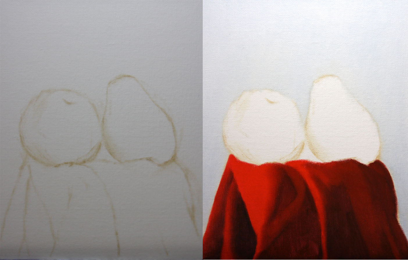
I started with the usual dry brush approach using no mediums and a bit of raw umber on the brush. Once the drawing is established I then state the shadow shapes on the figs and fill in the background, the colors I used for the background were ultramarine blue, naples yellow and titanium white.

After filling the background in I then fill in the shadow shapes, this stage is different than my regular process. I usually just big form model with their general colors and mesh the shadows within the modeling. I wanted to try something different I learned this back at school and have been teaching it for a while but for some reason never applied it to my alla prima's, I usually apply it to my longer paintings. Establishing shadow shapes lets you separate the lights and darks, the two hues do not have to mix with each other which keeps the colors clean. After filling in the shadow shapes I then establish the general colors in the lighter shapes, I just state where the color are on the object keeping the edges soft and not modeling the form yet.

When the colors are working I then work on big form modeling, this means I go where the shadow and light shape edge meet and mesh them together to turn the form. I also establish the lightest lights to really show the turn in the highlights with out adding details, remember I'm not concerned with details at this stage just a general statement of colors and making sure the form is turning with the light. Then I add small form modeling by breaking it up into two sections, the first section is stating the darker values with their specific forms.

Then I add the lighter values with their specific forms, usually after this stage is complete it brings this section to a finish. The colors I used on the figs were ivory black, ultramarine blue, cobalt violet, viridian, cad.yellow light, naphthol red, cad.red light, and titanium white. When the figs are complete I then start on the wooden board by stating the general colors and the fall of light. The colors I use for the wooden board are burnt umber, raw umber, cad.orange, ivory black, ultramarine blue and titanium white.

After the fall of light is established I break down the small form modeling into two sections, the first is stating the darker values with their specific forms. Then I add the lighter values and their specific forms, doing this brings the whole painting to a finish. I hope you enjoyed this one, I know I did, it was nice painting the texture in this painting from the figs to the board. Textures to me (if you haven't noticed by now) is the most important thing to learn how to paint, its what makes whatever you'r painting feel that its alive. The more I observe and really see the better I believe the painting can be.