Master Copy From Anthony Van Dyck
11 x 14 in
Oil on Canvas Panel
I've been experimenting with the Flemish technique, again. I am fascinated by the way
Peter Paul Rubens and
Anthony Van Dyck painted. There are many more other painters I look up to from the past but these two are on the top of my list. My past posts I was dabbling here and there with this technique (click
here to view the one I am referring to) , I thought I made some advances but fell short once I started applying it to other paintings. These shortcomings I find very educational as they are not failures, I see them as learning of what not to do for the next painting. The two paintings I am referring to is
"The Gypsy Life" and
"Eve" These two paintings were not up to my expectations. I don't dislike the paintings but to the level I want them to be, as of yet they're not there. I learned a lot from them and that is very important to point out. Since completing them I have ventured to different paintings and especially a different direction with my body of work. The new direction of work I am doing now I am wanting to mix with the Flemish technique. That being said I had to go back to the drawing board and figure this technique out. I am not saying I solved it and now I am a master at it, but I do think I am one step closer in understanding it.
In this post I will break down each stage of this technique. I copied Anthony Van Dyck's painting 'Thomas, Viscount Wentworth, later Ist Earl of Strafford' for this demo. I will share everything I learned and how I applied the paints and also mediums to the canvas. I hope you are able to learn as much as I did with this post.
The canvas panel I used was from
Dick Blick. I didn't prepare the canvas to any special modifications as this is just for practice. I toned the canvas with raw umber and mineral spirits. In the picture above you can see how I lay out the raw umber and mineral spirits (
I circled the placements of the mineral spirits) before I rub them together with a paper towel to get an even tone.
Tone
This is how the results should look, a medium toned canvas which is not too dark or light. If you want to go darker than this you can, but be careful not going too dark. I let this dry until I start the next stage. The drying time should be quick since raw umber is the fastest drying color and also mineral spirits dry extremely quick. You can start the next stage the following day, make sure the painting is dry and does not smear off the canvas.
Drawing
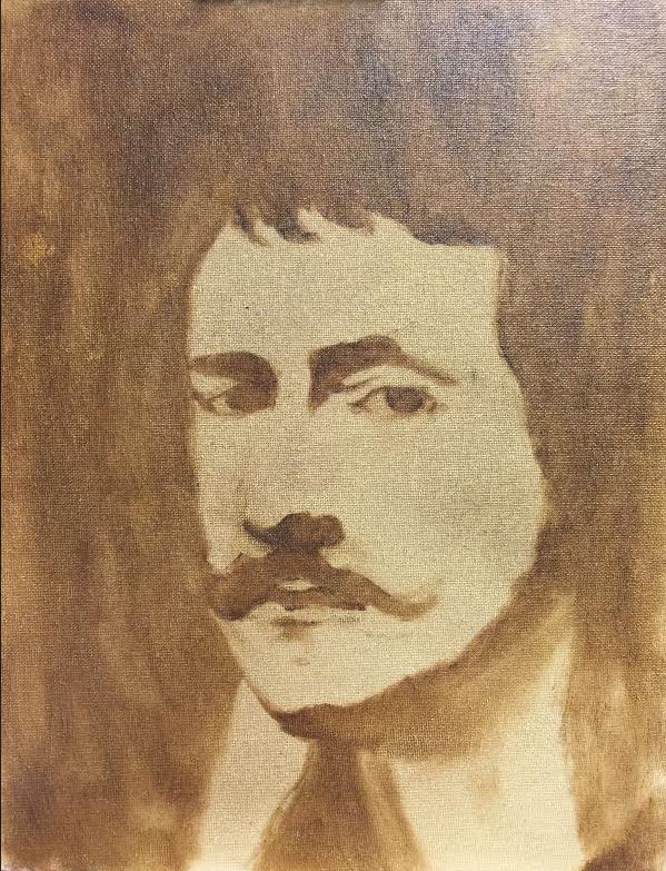
Once the canvas is dry I then start drawing light and shadow shapes. With this portrait Anthony Van Dyck simplified these two beautifully. I am using very little paint on my brush and drawing out the shapes to their correct placements. I am using raw umber and mineral spirits in minimal amounts. You do not need to use mineral spirits if you do not want to, as stated before raw umber dries very fast by itself.
Shadow Shapes Fill In
Once the drawing is looking somewhat like the subject I then paint in the shadow shapes or all the dark areas. I leave the light shapes and only fill in the shadow shapes. In this stage I am only using raw umber, you can mix mineral spirits if need be, especially if you have larger areas to cover. Just remember do not use large amounts of paints or large amounts of mineral spirits. You can move on to the next stage on the same day without letting it dry.
Under painting
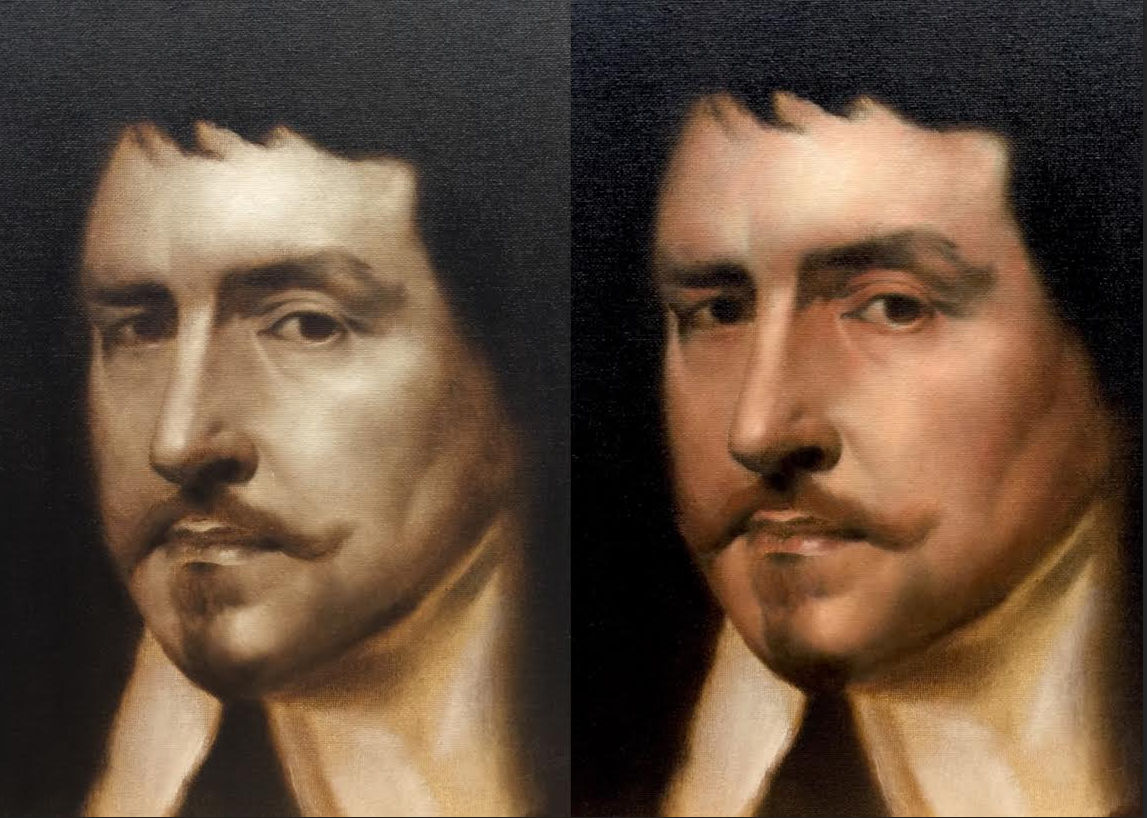
In this stage I only paint the values in the light shapes. I do not paint in the shadow shapes just the light shapes. The whole point of this stage is to get all the values right. I use raw umber, titanium white mixed with 2 parts mineral spirits and 1 part linseed oil. I start with minimal amount of paints. painting from thin to thick. I like to keep the high lights thicker to indicate texture. I take the portrait to a finish by rendering each area in the light shapes. Trying to paint the subtle shifts between values. This is important as you are laying the blue print down for when color is added you do not have to worry about proportions and other factors as you would in the under painting stage. You are completing 85 percent of the painting in this stage. Let the painting dry before moving onto the next stage.
1st Lay In
This stage I start by painting the darkest values first in the background as well in the shadow shapes. I apply the paints thin and build up to the consistency I want (Ivory Black, Raw Umber were used in the darks shapes). Once the darkest values are stated I move onto the middle/lighter values in the light shapes not the shadow shapes (Colors used in this stage were Cadmium Orange, Napthol Scarlet, Burnt Sienna, Naples Yellow, and Titanium White). I scumble the color back and forth without lifting the brush in this stage. Applying the color in thin amounts allows me to control the value of the hue. Since the value underneath is already stated this allows me to concentrate on hue, chroma, and texture. I am using 1 part mineral spirits and 1 part linseed oil.
2nd Lay in
After the colors are placed in their correct areas I then start taking each area to a finish. I do not scumble at this stage. I am dabbing the brush almost as if they were mini strokes. I don't use any mediums for this, although you can use linseed oil if need be. The lights generally do not need them but at times you might. I am controlling the chroma and value of the color by just the pressure I am applying to the brush. I then do a second pass with the darks in the background and the hair, this allows me to play with edges where shadow shapes meet the light shapes. Since the shadow shapes tend to sink in more than lighter shapes you can oil in the specific area with minimal amounts of linseed oil. The important thing about this stage is to take each area to a finish and dab the paints rather than scumbling.
This painting in total took about 6 hours to complete from beginning to end. The first thing I learned from this whole experience is the underpainting stage, getting it right is essential for the rest of the painting. This stage allowed me to only worry about the drawing and value and not about color. The second thing I learned is the 2nd lay in stage. Being able to render the color with out worrying about getting the proportion right was very nice. This allowed me to just concentrate on rendering the type of texture I wanted. As far painting handling dabbing the paints and having the correct pressure was key to getting the rendering I wanted. A great experience overall and glad I was able to document it.
Thank you for stopping by, until next time!