Thursday, February 24, 2011

"Blood Oranges"

Sold
"Blood Oranges"
8 x 10 in
Oil on Canvas Panel
Blood oranges are so beautiful in the way colors bleed from one to the other.  I wanted to also accentuate the reds with the red cloth and give the painting a bit more umph, the gradation of yellow to orange are intriguing to me as well to paint.  Painting red cloth can get tricky, one has to be careful the reds can get to pink when going lighter in value.  Incorporating red cloth into a still life was one of our first still life assignments when I studied at the Angel Academy in Florence, it's great practice when trying to tackle on so much red at one time.
I started again with a raw umber underpainting, I don't use any mediums I just use raw umber very thinly.  As soon as i'm done with the underpainting I start right away with the painting, I start with the first blood orange on the right.  Doing the underpainting creates a film of thin paint that acts as a couch for the main painting.  The colors I used for this area is naphthal red, cad. red light, ultramarine blue, burnt umber, cad. yellow, and cad. orange.  For the first blood orange I decide to paint the main keys first by forming the bigger forms first.  Thinking of big form modeling when applying the paints at this stage and not so much of the details.
I do the same application to the other blood oranges, I do this to take them to a finish at the same time.  After the forms turning and the colors are working right I go back to the darker values and shadows and take them to a finish.  I also add some reflected light in certain areas.
Once the darker values are completed I move onto the middle to lighter values and start narrowing down to the smaller forms or the details.  For the highlights I just apply titanium white and work them into the middle lighter values.  Through out this painting I'm constantly walking back and forth to my painting, you can never judge the painting up close you have to stand about two feet away from it to get an accurate look.  I strongly recommend you guys to do this it forces you to stand back from your painting, if your constantly up close to your painting your more and likely going to overwork certain areas and not realize it.  
After the blood oranges are completed I move onto the red cloth by adding the middle to darker values.  I try to preserve the white of the canvas for the lightest areas of the cloth.  For this area I use naphthal red, cad. red light, ultramarine blue, and burnt umber.  Then I add the lighter values of the cloth and mesh the darker values with the middle to lighter values.
After the cloth is complete I add the wooden base by using ultramarine blue, burnt umber, cad. orange, cerulean, and titanium white.
For the background I used cerulean blue, naples yellow, and titanium white.  By this stage I'm able to go around the whole painting while adding the background and soften certain edges.  Doing this brings the painting to finished look and completes the whole process.  It was fun revisiting the red cloth and playing around with its folds.  I hope to compose more paintings in the future in the same manner.  Thanks for stopping by, I hope you enjoyed this one.


Saturday, February 19, 2011

"Anaheim Pepper"

Sold
"Anaheim Pepper"
5 x 7 in
Oil on Canvas Panel
I wanted to approach this painting in a flemish technique way, concentrating on the underpainting for the  most part.  I've been noticing if you get the underpainting done right,  the painting after goes very smoothly.  I decided to try this method with the Anaheim pepper, the colors mixing from one another made it intriguing to try.  With peppers I'm always attracted to the in between stage of its colors shifts, it's really neat seeing how these colors harmonize with each other.  
I started the drawing with a dry brush approach just using raw umber, I took the drawing stage further and put more of the middle to darker value shifts.  I did this to get the drawing and value shifts just right, this in turn makes the painting go much quicker and I can have more fun playing with the paints.  After the drawing is completed I started from the left of the pepper, I start with the middle to darker values.  The palette I'm using is viridian, cad. yellow, and cad. orange.  As you can see with the second picture the underpainting serves as a blue print for me to go over and match the values and shapes.  
I proceeded to add the darker tones by just using raw umber and ivory black.  Then I started to mix more of the lighter values into the middle values by just adding titanium white.  The more I was advancing with these sections the more I can add the smaller forms or details.  Remember always start thin and work up to the layers of thickness you're going for.  I personally like to go thin and get thicker in some areas especially the lights.  Staying thin with your paints also allows you to mix easier and have smooth transitions of values, once you understand this concept it gets easier to blend thicker paints.
After finishing the pepper I move onto the base working on the cast shadows and middle values.  The palette I use for this area is ivory black, raw umber, burnt sienna, cerulean blue and titanium white.  I first concentrate on the cast shadows going section by section and paying special attention to the edges that meet with the pepper.  Then I work on the base and try to get the light source right.  
After my darks are stated and I have the lights working right I go back into the lighter areas of the base and some of the darks as well, and add more details.  I don't wanna go overboard and get too detailed, this will take the attention away from the pepper.  After the base is completed I move onto the background by using cerulean blue, naples yellow, and titanium white.  I'm pleased with the results when finished, I liked doing the underpainting in the beginning.  It kept my guessing to a minimal and allowed me to have more fun playing with the paints, I definitely recommend you guys to try this way of painting.  Usually a flemish underpainting is with raw umber, ivory black, and lead white.  Those three allow you to get a wide range of values and complete the underpainting to a high degree of finish.  I experimented with this painting just using raw umber since it's an alla prima painting and the process is a bit quicker.  Thank you for dropping by and viewing, I hope you enjoyed and if you have any questions please do not hesitate to ask.  Take care.


Wednesday, February 16, 2011

"Tangerine & Vase"

Sold
"Tangerine & Vase"
10 x 8 in
Oil on Canvas Panel
Hi everyone I'm back! I was gone on vacation visiting family in Miami for a week, I forgot to bring my paints with me so I sketched in my book the whole time.  It was so good sketching again its been a while since I've drawn like that, I truly missed it and had so much fun doing it.  I'll post the sketches up soon.  
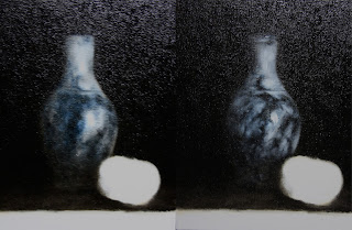
This painting is a little different than my usual alla prima's, I decided to paint a porcelain vase and a marble base.  These two surfaces demand a lot of concentration in order to get the textures right.  The lighting I used also created another challenge in order for them to look right.  Adding the tangerine was important in order for the chroma to pop and to keep your eyes moving around.  Playing with this lighting, composition, and objects was more fun than I thought. 
I'm sorry for these bad pictures its hard to get a good picture with such dark background, the glare is too much for me.  The first pic is of the drawing stage I used raw umber and no mediums.  Once the drawing is completed I start filling in the background with pure ivory black.  I don't apply thick passages from the get go, I keep the paints thin in the beginning and get thicker with them especially with the background.
Then I start with the vase just worried getting the form right and roundness to it.  Then I start getting down to the details just adding them in the right areas and pushing the edges.  I'm keeping aware of the form and how it turns with the light.  I've also added the highlights with just pure titanium white, I went really thick with the whites in this area.
Once the vase was completed I moved onto the tangerine applying the local colors first and making sure the form turns.  Then I go back to the darks in the tangerine and take them to a finish, I used cad. orange, raw umber, ivory black, cad. red light, cad. yellow light.  Then I add the highlight by using titanium white. 
Then I filled in the marble base by applying the middle color, titanium white, and raw umber.
This is the finished picture, I added the details to the marble and highlights.  Its fun painting marble again, creating its unique textures is always a challenge but worth it in the end.  I hope you enjoyed this one, thanks for stopping by!


Tuesday, February 8, 2011

"Peaches"

Sold
"Peaches"
8 x 10 in
Oil on Canvas Panel
Peaches have great characteristics to them, their skin for one has beautiful designs to them.  Along with the designs there's also some fuzziness to them, these two components create a great challenge in painting these textures.  Not only there designs and texture are great but to eat them when the painting is complete makes it a better incentive to finish.   
I started with the usual dry brush approach for the drawing stage, keeping the lines light so I can easily correct any changes.  After the drawing is complete I start on the first peach, I start in a rather scumbling approach.  I get the local color and start light with the pressure in order to get a soft and even value.  Then in order to get a thicker application I add more paint or press a bit harder on the brush just as you would with the pencil.  For this stage I'm using cad. red light and raw umber.
Then I start using cad. yellow light, and ivory black to give more accents to the middle and darker values.  I start going to my lighter values at this stage as well, this allows me to see how dark I need to go with the darks.  Then I just concentrate on the darker values and take it to a finish.
After the darker values are completed I move onto the lighter values and highlights.  Once thats completed I move onto the other peach, just concentrating on the local colors and making the form turn.  I'm keeping the paints really thin in the beginning application, this allows me to keep control and have smooth transitions.  I'm using the same palette as the first peach.
At this stage I start adding smaller forms or the details to give the shape more character.  I'm also trying to be careful in making these intricate shapes work with the whole form.
Once the second peach is completed I start on the wooden base, I use ivory black, raw umber, burnt sienna, cerulean, naples yellow, and titanium white.  
Once the wooden base is completed I then state the background by using titanium white, naples yellow, cerulean, and titanium white.  When I'm done with the background I go back to the peaches and just push the highlights a bit more, I also do the same with the wooden base.  I had lots of fun painting this one, experimenting with painting textures and trying to get the fuzzy look that a peach has.  It's a great way to push yourself and see how your able to render these different textures.  One thing is painting an object, the other is actually making the viewer feel as if it's touching it.  Thanks for stopping by and viewing, I hope you enjoyed this one!


Saturday, February 5, 2011

"Red Plums"

Sold
"Red Plums"
8 x 10 in
Oil on Canvas Panel
Hi everyone hope your weekend is going well so far, i'm about to go to an opening event for Titian and the Venetian masters at the Minneapolis Institute of Arts, here's the link: http://www.artsmia.org/titian/ .  I'm so excited to see these paintings in person, to see Titians up close and Tintoretto and Veronese its gonna be so much fun.  It's also an event which they are throwing a show with venetian style masks and entertainment.  To say that I'm excited to go to this an understatement.
This painting of these two plums I wanted to do in a Chiaroscuro manner, which became more difficult than I thought.  In order to paint a successful dark background in one session with strong chroma colors you have to control your hues and values very carefully.  It's been a while since I've done a painting with so much dark in it, I remember back in Italy all of our paintings where done this way.  It's a great way to emphasize color and your focal point.  I don't have any process photos with this one because the pics weren't to good, sorry about that.  The plums in process looked bleached out in the picture and you couldn't see the painting to well.  This painting in a way pays homage to the venetian masters and brings me back to my roots and fundamentals in painting.  Thanks for stopping by, hope you enjoyed!   

Tuesday, February 1, 2011

"Nectarine & Pear"

"Nectarine & Pear"
8 x 10 in
Oil on Canvas Panel
Hi everyone this painting is of the two main subjects of my last couple paintings.  I really love the way the reds and yellows mesh within these two, shows a relationship between them.  Its always a challenge painting with these two colors in any circumstances due to their strong chroma's, it's a great learning experience seeing how one can control the value and chroma.  When finished with this painting, I indulged in these two fruits and they where beyond delicious.  Makes me wanna keep painting more of these guys, as for now I think its time to move onto a different subject.
I started with the traditional dry brush approach using no mediums and just a bit of raw umber for the drawing stage.  After the drawing stage is completed I start on the nectarine, I scumble the beginning layers of the middle value before I get into the darker values.  The palette I'm using is cad. red light, raw umber and ivory black.  This scumbling effect is almost as if drawing with a pencil, you want to start light and press harder if you want a darker value or more opaque.
Then I start stating more of the reflected lights when adding the darker values, I'm using cad. orange and cad. yellow light in addition to the palette already described.  When the darker values are finished I move onto the middle to lighter values.  I like to creep up to my lights, this allows me to still treat the painting as a drawing.  
After the nectarine is completed I start on the pear, stating the middle to darker values.  With the pear I wanted to work more on big form modeling the whole shape.  I still added the local colors in a scumbling manner, keeping it thin so the additional layers of paint will not get to thick and uncontrollable.  I'm using the same palette as I did with the nectarines.  
When the bigger form is turning and is conveying the information I'm looking for, then and only I start to add the smaller forms or the details.  Still keeping the paints thin so it mixes well with the layer thats already on the canvas, I go a little thicker only to get a higher chroma color or to state a gestural stroke.  I do like going really thick in my highlights.  
I then start to add the information to the wooden base, starting with the darker values by using ivory black, and raw umber, cad. orange and burnt sienna.  Then I add the middle to lighter values by just adding titanium white.  When stating this information I start seeing more of the darks effecting the overall value of the pear and nectarine.  I do go back in the end and shift a couple values here and their, but these are minor changes that occur in the end.
This is the final pic, I stated the background by using cerulean, burnt sienna and titanium white.  I was very careful when going around the edges.  I made sure to soften some edges and keep other edges nice and crisp.  Its always important to understand how edges effect you'r painting, if you truly can understand edges and its complexities than your ahead of the game.  This was a fun one to do and hope you enjoyed it as much as I did, thanks for stopping by!