Sold
"Pear"
7 x 5 in
Oil on Canvas Panel
This pear caught my interest when I was at the grocery store, the reds and yellows bleeding into each other was to good to not paint. The blend of these colors reminds me the change of seasons, which I am really excited for. The winters up here in Minneapolis gets to be to long at times, and this year it seems to be longer than usual. I know its only January but its been snowing like crazy and really cold, I'm anxiously waiting for the change of seasons. On the flip side this type of weather is perfect for staying in and painting, so I really can't complain.
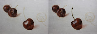
I started with the traditional approach of using no mediums and just a bit of raw umber on the brush for the drawing stage. After the drawing stage is completed I started on the middle to darker values first. As you can see with the second picture I start with a very thin application of a cad. yellow and raw umber for the mixture.
Then I start stating more of the local colors and darker values as well, I used ivory black, raw umber, cad. red light, cad. orange, and cad. yellow light. I'm starting really thin for the beginning stages of the application and also placing the colors in the correct areas. If you just put the wrong value and chroma in an area and build up to the right colors, your paints are going to get thicker quicker and your not going to be able to control the look your going for. Unless you really like painting really thick then its not a problem. I try to state the colors in the right areas and build up to the look I am going for from thin to thick.
Then I start adding stronger chroma's of cad. red and cad. orange. As you so can see I work up to my lights, I kind of sneak up to them. This allows me to control the look I'm going for with the stroke and chroma. Then I add lighter values or highlights by just applying titanium white, I add these strokes thin then go thicker to get the gestural strokes I want. After the pear is finished I move onto the base by stating the darker to middle values first. I use ivory black, raw umber and burnt sienna. For the middle to lighter areas of the base I use the same mixture but go really thin with the raw umber which gives me a lighter value first, it I want the value of the raw umber to go darker then I press harder with brush and its also gets more opaque. Think of it as drawing with a pencil, you can control the tone of the graphite by lightly pressing on the pencil, then applying more pressure to get a darker tone. It's the same principle when I paint.
I then added the background after the base was completed, I used cerulean blue, titanium white and naples yellow. I've noticed I like adding the background later now, I used to like adding it in the beginning but now I find it beneficial to do it later. Reason being I can control the edges of the objects better and when I add the background I can easily work into the edges. I jump back and forth from stating it in the beginning or later, for now I like doing it later. Thank you for stopping by and viewing, I hope you enjoyed this one.


