Thursday, April 29, 2010

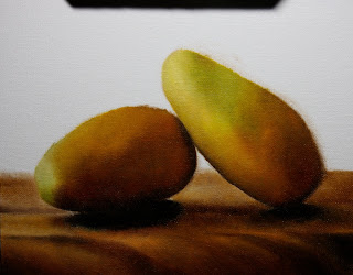
"Mango Ataulfo"

Sold
"Mango Ataulfo"
8 x 10 in
Oil on Canvas Panel
These mangos were so much fun to paint, they are very unique.  I have never heard of these mangos before, I love going to the local market and finding unique fruits and vegetables from all over the world.  I also wanted to let everyone know that I will be teaching classical painting and drawing, and figure drawing at a new academy opening up in Minneapolis.  The name of the school is "Classical Academy of Art" you can see the website here, if you are interested in taking classes with me let me know or you can go to the site and sign up as well.  
I started with the usual dry brush approach, no mediums on the brush just a little burnt umber.
I then went straight into the darks of the mangos, using burnt umber, permanent rose, and ivory black.  I am keeping the paints really thin in this stage so it dries quicker.
Then I started to add the mid tones and a little of the lighter tones, I used viridian, cobalt blue, cadmium yellow light, cadmium orange, and permanent rose.  You can see that I am dabbing the colors in the areas they need to be in, I'm not pressing too hard with the brush so I can get the subtle tones that I want.  I treat the brush how I would treat my pen or pencil when I draw, each stroke you lay down you have to be aware of the tones and edges that you'r stating because it leads one to the other.
The highlights are then introduced after the mid tones are looking right, I go back and forth making sure that the form is turning with the values and chroma's that I am laying down.  Again these layers are pretty thin it's a good rule to always remember fat over lean, you want to progressively get thicker with your paints in each layer that you paint.  This will prevent your painting from cracking in the long term.
Then I added the base and a bit of information in it, this is a different base that I've painted before.  It was the bottom of a wooden tray that we use, I love the patterns it has.  I am laying down the paints thin and also going around the edges with the mangos and softening it and bringing some edges sharper, but again not going to thick with the paints.  The colors I used for the base was yellow ochre, burnt umber, permanent rose, and ivory black.
Then I added the background, I used cobalt blue, naples yellow, and titanium white.  Again just going with the background color around the edges of the mango's and base, making sure the edges are softening and meshing with the subjects.
I then went back into the base and started to add the lighter tones which was naples yellow, yellow ochre, and titanium white. I also went into the mangos and started to add more of the mid tones and darker tones, in this stage I start slowing down and be more aware of subtle tones within the mangos.
The highlights are stated as well with the mid tones in the mangos, I also went back around the mangos to clean the edges and look more presentable.  The overall painting was a delight to do, these mangos have subtle colors going into another which makes it so cool to paint.  I hope you guys enjoyed this one and thanks for stopping by!

Tuesday, April 27, 2010

"Red Radishes"

Sold
"Red Radishes"
8 x 10 in
Oil on Canvas Panel
I had so much fun with this painting, it kind of reminded me of the grape series that I did.  The overall experience with this painting was extremely pleasant and always learning new methods on how to improve my technique.
I did the drawing in a dry brush manner no medium just very little burnt umber on the brush, then I went into the darks automatically since the majority of the painting is really dark.  I used ivory black for the first thin layer, I did this because it's easier to judge how light I have to go with my tones.
Then I started in the radishes, in this stage I used cadmium red, permanent rose, and ivory black.  I am just concentrating on the forms in this stage, making sure they are turning and looking believable.
I know I know, I skipped a lot of steps with the photos.  I apologize at times I get carried away painting and forget to stop and take a photo.  What I essentially did from the last pic to this one, I went into the leaves and just added the middle tones no highlights or details just making sure again that the form was turning accordingly to the lights.  Then I went into the base and added the middle tones, basically a dead coloring stage, no details just to get the feel of the base.  For the base I used titanium white, yellow ochre, and burnt umber.  As you can see with this picture I then went back into the radishes and introduced the lighter tones which was cadmium red, permanent rose, and titanium white.  I am dabbing where the highlights should be always being aware how much pressure I apply to the brush.  In the leaves I used cobalt blue and cadmium yellow light, and titanium white.  I am going back and forth with the darker tones to the middle and lighter tones, always being aware of the subtle tone shifts.  
I went back into the darks and added the second thicker coat of ivory black, when I say thicker its just slightly thicker than what I applied the stage before.  I am also making sure my edges are softening in there appropriate areas, then adding smaller details to the radishes such as their roots and skin textures.  
I then went into the base and started to add the details of the wooden base.  I used very little paint in this stage as well just being aware of the subtle shift of tones from one value to the other.  This is the finished painting, it was a real treat painting this one.  I am always learning things from these daily paintings, it's a great test to constantly push ones limits.  Thanks again and hope you enjoyed!

Sunday, April 25, 2010

"Pineapple"

Sold
"Pineapple"
8 x 10 in
Oil on Canvas Panel
This is a painting that I have been wanting to do for a while, at this forum people voted for me to paint this pineapple.  I apologize for everyone who voted who had to wait for me to produce this painting, I also apologize for not posting in recent days I have been so busy and finally I am able to get back to the grinding wheel of painting and posting.  With this painting I decided to paint the pineapple in a different view instead of painting all in one composition, which I did my first go around and lets just say this view is way better.  I wanted to have it off centered and also have a sense of fall of light, the textures on the pineapple are really intricate to paint and tricky especially when one is limited on time.  Overall fun painting to make and hope to paint more of these guys in the future.
I started with my normal approach I always use no mediums just a little bit of burnt umber on the brush and draw out the subject on the canvas.
After the drawing is in the stage I want it to be, I went in and stated the mid tones then to the darker tones.  I am just dabbing the colors in the right areas and blending them after however much they need to be blended.  I am also not applying thick paints in this stage they are fairly thin when I start out.  The colors I used in the this stage are burnt umber, yellow ochre pale, viridian, french ultramarine blue, and ivory black.
I then started to form more of the shapes when the colors where starting to come out, I added the darks which were french ultramarine blue, and ivory black.  I went from the bottom to the top of the pineapple just going back and forth with the mid tones and lights, making sure forms where turning.  At this stage I was having a difficult time with the details in the pineapple in the bottom section, they are so unique looking.  It was tricky painting this section but learned a lot in the end when I was done.  I started to introduce some burnt sienna, yellow cadmium light, and titanium white in the mid light tones.  Then the leaves on the top of the pineapple I started to add some of the cool colors for the highlights which were cobalt blue, cerulean blue, and titanium white.
Then I moved on to the background, I used yellow ochre pale, burnt umber, cerulean blue and titanium white.  When I covered the background I made sure to pay attention the edges, It's extremely important to always be aware of your edges in every stage of you'r painting.  Edges can make or break a painting, its something one can easily overlook or over due, if done right it will take you'r painting to the next level.
This is the finished painting, I went back to the bottom half of the pineapple and worked the highlights.  I don't know if I am ready to do another pineapple, they are very challenging to do.  I learned a lot with this guy, struggled in certain stages of this painting especially when one is in a time crunch to finish the painting.  But I think thats what makes these paintings so exciting, to produce a good painting in such a short period of time, one gets to learn from its mistakes and successes and hopefully carry it onto the next painting.  Thank you for viewing, hope you had fun!


Wednesday, April 21, 2010

"Salt & Pepper"

Sold
"Salt & Pepper"
8 x 10 in
Oil on Canvas Panel
I found these two objects at my girlfriends great aunts house, they are so vintage looking that I had to paint them.  I can tell you I have never seen a salt and pepper looking like this, it was to good not to paint it.  I decided not to have them upright looking identical but have one on its side spilling out some salt, telling a story in a way.  This is a good break form painting fruits and vegetables, I hope to find more of these interesting objects to paint in the future.
I started with a dry brush approach as usual, no medium just a little of burnt umber on the brush.  The drawing cannot be as loose as I want it to be, I have to get the proportions right at this stage.  
After the drawing is in the level I want it to be I start filling in the larger forms and making them turn.  For the mid and dark tones I am using burnt sienna, yellow ochre, and ivory black.  Just loosely laying in the colors not worried about getting things perfectly smooth.
Then for the mid lights and highlights I used cadmium yellow light, yellow ochre, and titanium white.  I have made sure that the larger forms are turning and started to smooth it out when I really did not need to in the stage, at times I just forget what I'm doing and get into my little world of blending.  You can see that I sneaking into the darks on the base with the cast shadow of the salt shaker, I am just using ivory black in this stage.
Then I just filled in the base with burnt umber, burnt sienna, and ivory black.  Again not worried about details just laying the main color so I can go in and mix on top of that color later.
Then I added the background using cerulean blue,  yellow, and titanium white.  I also made sure to soften the edges to push back some areas.
I then went back into the salt and pepper and started to work on the smaller forms, reiterating the mid and darker tones.  Then I started introducing more of the lighter tones, I am going slower in this stage so I can be aware of the subtle tones.  At times I forget but it's a good rule of thumb to finish an area at a time, it will make you finish you'r painting much faster.  At this stage I was working on the salt shaker on the left and then I went to the pepper shaker on the right.
Then I introduced lighter tones to the base and also smaller details, you can see grains of salt laying on the base.  I would of taken the base further but I just wanted to concentrate more of the attention to the salt and pepper.  This painting was a lot of fun to do, hope you enjoyed this one!

Monday, April 19, 2010

"Turnips 2"

Sold
"Turnips 2"
6 x 8 in
Oil on Canvas Panel
I started with dry brush as usual with no medium, then I started to lay in the colors within the turnips going from dark to light making sure the form was turning before getting committed with details.  The colors I used were quinacridone magenta, ivory black and titanium white.
Then I just stated the background and base colors, I used burnt umber and ivory black for this stage.
After the background was stated I started putting in the mid tones through out the whole painting.
I then started playing with the texture of the wood and also within the turnips.
This is the final painting, not my favorite but I have to show it.  I was going for a quick and real loose painting, I think achieved the looseness but I do not think I achieved the quality that I wanted to.  As you can tell its not the technique I am comfortable with but I really love the loose and broad strokes that I see in paintings and respect it.  I think its good to try new techniques in order to develop yourself as an artist, even though it means to produce not so great paintings.  I hope you somewhat enjoyed this one!

Saturday, April 17, 2010

"Bananas"

Sold
"Bananas"
8 x 10 in
Oil on Canvas Panel
I started this painting with my usual burnt umber dry brush approach in the drawing stage, what I liked about this painting is the composition and the silhouette.
Then I started from the mid dark tones which was burnt umber and a bit of ivory black, I am keeping this stage fairly thin with the paints so its easier to build upon.
I then started to state the mid light tones and some of the blacks, for the mid light tones I used cadmium yellow light, naples yellow, and a little of titanium white.  For the blacks just ivory black and I also went into the shadows of the bananas with burnt umber and cadmium orange.  Whats important from this stage is making sure the forms are turning according to the fall of light, just concentrating on the larger forms and not on the details.
Then I covered the base which was burnt umber and ivory black.  I just stated the overall tone of the base not putting anymore information and also keeping the paints thin.
From the base I moved onto the background which I used naples yellow, cerulean blue, and titanium white.  When I am done covering the background I go back where the edges meets the bananas and base to soften the edges.  Its important to play with the edges, it's a vital role in creating the illusion of reality with you'r painting
I then went back into the bananas and starting to smooth things out, adding a thin layer of paint in the shadow areas and also adding thicker paints in the lights.  Now when I say thicker paints I do not mean I add so much paint I am just adding a tad bit more paint than what I would in the thinner areas its all what the area of the painting calls for.  I am also adding the smaller forms in the bananas to give them some character.
Then I moved onto the base and started to add the smaller forms, I used cadmium orange and burnt umber to add the grains and reflected lights.  You can see better with this picture the true color of the background, this is the finished painting I would love to go on and add more details but these are daily paintings and you have to know when to stop.  Sorry for the delay in posting this one I have been really busy lately but getting back on track!  Thanks again for stopping by and viewing, hope you enjoyed this one!


Wednesday, April 14, 2010

"White Roses"

Sold
"White Roses"
8 x 10 in
Oil on Canvas Panel
I started this painting with a dry brush approach, no mediums and a bit of burnt umber on the brush.  I didn't put to much information inside the roses, I will do that with the correct colors.
I then went into the leaves and stems since they are the darkest area of the painting, I used ivory black, and viridian.
After the leaves and stems where stated I moved onto the background, just adding a thin layer of cerulean blue, naples yellow, ivory black and titanium white.
Since these are white roses I cannot just put heavy colors on at first, my strategy was to preserve the whiteness of the canvas since thats the whitest you can go.  By doing this I can concentrate on the darks and slowly go into the lights.  For the mid tones I used burnt umber, cadmium orange, ivory black, and titanium white.  I do not have a lot of paint on my brush in the level just keeping it thin.
After the mid tones where stated I went into the mid light tones and light tones.  There's a bit of color in the white roses, it picks up surrounding colors.  I introduced into the roses some yellow ochre pale, and cadmium yellow medium.  I am also putting titanium white in the highlights, I am doing this so the mid tones can flow into the lights.  I then go into the stems and state the greens, I used cobalt blue, and cadmium yellow light.
At this stage I am re-stating the darkest darks in the leaves and stems.  This will pop out the roses even more, I am just using ivory black for this.  I also went into the roses and stated the darkest darks, I used burnt umber, ivory black, and cadmium orange.
After the darks where stated I also added some light greens in the leaves to bring some light into the darkness of the leaves.  I also went back into the roses and smoothed out certain areas and kept others pretty loose.  In this final stage I take things slower in paint application, the light areas I tend to go thicker so the paints can catch the lights and in the darks I like to keep it thin.  I hope you enjoyed this one, it was a lot of fun to make!