Friday, October 29, 2010

"Fuyu Persimmons"

Sold
"Fuyu Persimmons"
8 x 10 in
Oil on Canvas Panel
Hi everyone I hope you guys have a great Halloween weekend!  What your costumes gonna be?  I saw these fruits at the store and was intrigued by them, they look as if they're a mix of tomatoes and oranges.  Their name is "Fuyu Persimmons" thats what it said on the tag at the store, pretty interesting looking fruit.  I really like the intense oranges and yellows that wrap around the skin, the leaves on the stem also give this fruit some character.  It was also nice playing with the composition, having the two fruits playing along the edge giving some intense drama.
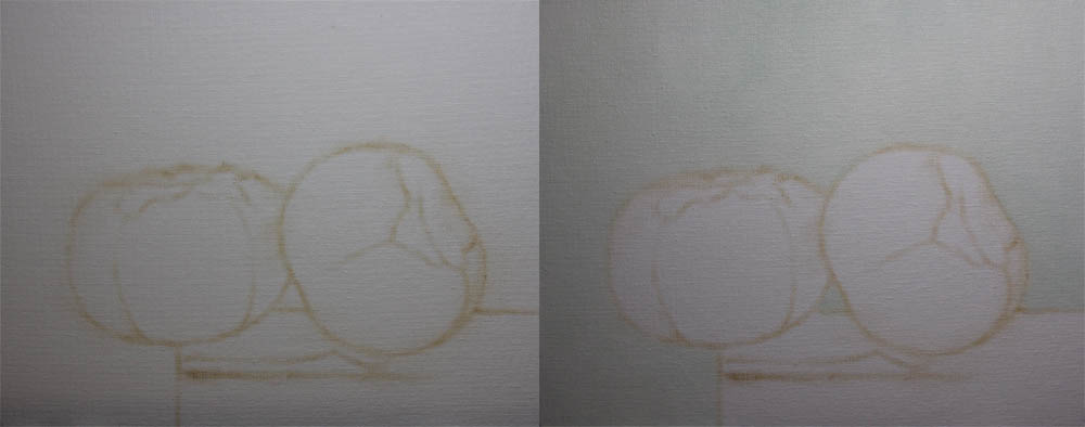
I started with usual approach of raw umber and no mediums for the drawing stage.  After the drawing was done I filled in the background using cerulean blue, naples yellow and titanium white.  I like filling the background it lets me work the edges better in the foreground.
Then I covered the base using ivory black, burnt sienna, an cad. orange.  For the lighter values I used burnt sienna, cerulean blue, and titanium white.  With the edge of the base I softened it a bit to give the illusion it was going back into space and it'll also bring the fruits to the foreground.
I then start covering the darker values in the first fruit, I used ivory black, cad. orange, and cad. red light. At this point I'm putting the color notes in the right areas without mixing them perfectly, once the colors in the right spot I start blending them to where there suppose to be.  Then I start the same process with the middle values using cad. yellow light,  and cad. orange.
Then I fill in the lighter values using just titanium white and mixing it into the middle values.  After the body is done I start on the leaves going from darker values to the lighter ones.  I used Ivory black, cerulean blue, and cad. yellow light.
Then for the middle and lighter values I used the same mixture as before but with some titanium white.  I'm keeping some edges soft and other a little harder to push the values as well.
After the first one is done I moved onto the second and used the same color mixture as I did with the first one.  Again I'm laying the color notes in the right areas and blending them afterwards to the look I'm going for.  After the darker values are done I move onto the middle and lighter values, again using the same mixture as the previous fruit.  
I then start on the leave portion of the fruit using the same palette as the previous one, going from the darker to lighter values.  
This is the finished picture, it was a lot of fun painting this one.  It was also challenging painting the subtle values of these fruits, there were hints of reds that were hiding to pop out certain sections.  It was a constant learning process to see the colors going from one value to the next.  I hope you enjoyed this one, thanks for stopping by!


Wednesday, October 27, 2010

"Squash"

"Squash"
10 x 8 in
Oil on Canvas Panel
Well I decided to paint a squash which is similar in shape and texture to a pumpkin, and I did not have fun painting my last pumpkin painting.  I knew this was going to be a challenge for me in many ways, which is also exciting.  The textures in the squash are somewhat subtle but in other areas are pretty apparent.  As you'll see in my explanation of this painting I decided to paint this one in a different approach, one of the reasons is to be done to take advantage of natural light.  I use natural lighting to take photos of my finished painting, and since it's not summer anymore the light has been getting dimmer quicker throughout the day.  It's a good challenge to finish in a certain period of time, a lot of pressure though.    
I started with the my traditional approach of using no mediums and just a bit of raw umber on the brush.  After the drawing is established I added the background using cerulean blue, naples yellow, and titanium white.  
After the background is filled in I started on the shadows of the squash using cad. orange, raw umber, and ivory black.  At this point I'm dabbing where the darker areas are at and also where the middle darker values are at, i'm not worried about blending everything perfect now.  The second pic shows this procedure taken further, I started to dab the middle and a little of the lighter values, its just to get a placement for all the values.  It's not my usual approach but I wanted to try something different with this squash painting.  
After keying in all the values I went back to the shadows and took it to a finish, then I went to the middle values and did the same taking that area to a finish.
I also stated the stem of the squash along with the lighter and middle values, the colors I used for the lighter values were naples yellow, cad. yellow light, titanium white, and cad. orange.  For the highlights of the squash I went really thick with the paint to describe the textures better.  When the squash was completed I moved onto the base using ivory black, cad. orange, and burnt sienna.  
Then I added the middle values using burnt sienna, cerulean blue, and titanium white.  After the overall key nots where places I went back and added the smaller details.  Approaching this painting in a different way than I usually paint was fun to do, it pushed me in many directions and allowed me to experiment.  That's the point of these alla prima paintings that I paint, to push and develop my technique as far as I can.  Thank you for stopping by and viewing my painting, hope you enjoyed it!


Monday, October 25, 2010

"Petite Pastry"

Sold
"Petite Pastry"
7 x 5 in
Oil on Canvas Panel
Hi everyone today has been raining and getting colder as well, basically a perfect day to stay in and paint.  Its been fun doing larger paintings and switching to these smaller alla prima paintings.  I saw this petite pastry at the grocery store and it reminded me of the pastry I painted a while ago but much smaller, hence the name "petite".  Ofcourse I bought it and the good news was they gave me two for one!  These pastries have been so much fun to paint, learning how to render different textures and bring out the intense colors that are hidden within.  A good treat to a rainy day.  
I started with the usual dry brush approach using no mediums with a bit of raw umber.  After the drawing was establish I added the background first using cerulean blue, naples yellow, and titanium white.  Then I added lighter values of the base using yellow ochre, naples yellow, and titanium white.  I also added a bit of the background color to mesh the two together.  
Then I added the darker values to the base using burnt sienna, and ivory black.  When the base was done I moved towards the blue berries, I used ivory black for the darker values. 
Then I moved towards the lights using cerulean blue, ivory black, and titanium white.  I kept meshing the darker and lighter values together dabbing the correct values where they need to be placed at.  I then started on the raspberry doing a large form modeling technique, I used cad. red light, burnt umber and ivory black.  
For the lighter values I used titanium white and a bit of cerulean blue.  When painting the raspberry I wasn't thinking of painting every single circle, I wanted to paint the impression of the circles.  At times its best to give the impression of the texture rather than painting every hair on a dog, doing so can kill the painting and the look you'r going for.
After the raspberry was done I moved to the base of the pastry starting with the middle and darker values.  I used burnt sienna, raw umber, and ivory black.  As you can see I dab the values where they need to be starting with a light pressure and going harder if I need a darker value, remember its all about control.
Then I added the lighter values using naples yellow, yellow ochre and titanium white.  I also started to add the glaze of the base meshing them with the blue berries and raspberry.  Then I added the dark cast shadows of the pastry on the base, I used ivory black, cerulean blue, and titanium white.  Overall I like the finish of the painting, it was a little quickie to do on a rainy day.  Painting different textures always bring a level of difficulty to a painting, but its all worth it in the end.  Thanks for stopping by and viewing my painting, hope you enjoyed!


Friday, October 22, 2010

"Cherry on top"

Sold
"Cherry"
7 x 5 in
Oil on Canvas Panel
Back to painting delicious desserts, I noticed at the store they started laying out new pastries that look splendid.  Of course when they look more beautiful they come with more challenges in painting certain textures.  What I like about this painting is that the cherry is in a way framed to be the main subject of the painting.  It gives homage to this beautiful and delicious fruit, needless to say after painting this one I indulged in this dessert.
I started with the usual dry brush approach for the drawing stage, I used a bit of raw umber on the brush and no mediums.  Then I filled in the background with with burnt sienna, cerulean, naples yellow, and titanium white.
Then I started with the cherry, I used cad. red light, burnt sienna, raw umber, and a bit ivory black for the  dark accents.  As you can see with these pics I start pretty thin in my initial layers, then I start building up more paint where it needs to be more opaque and also to have smoother transitions.  I'm also building up to my lighter values and highlights.  
Then I put the lighter values and highlights on the cherry by just using titanium white.  I then start on the whip by stating the middle and darker values, I used ivory black, titanium white and a bit of yellow ochre.  Painting this section is really challenging because of so many subtle values are within, I make sure to really work towards my lights and preserve the white of the canvas for that. 
Then I added the highlights to the whip by using titanium white and a number 1 brush to really give a harder edge within the whites.  I've also gone back into the cherry and added the reflected lights from the  whip to tie the two together.  Then I started on the chocolate area of the pastry or the body of the pastry, I used burnt sienna, raw umber and ivory black.  As you can see in the second picture in this section I build up to my values, I don't like putting excess paints which will become uncontrollable or make the colors muddy.
I kept building up my values until I got it just right and made the form turn.  Then I added the lighter values which are next to the whip by using burnt sienna, titanium white and naples yellow.
Then I added the base, I used yellow ochre, naples yellow, cerulean, titanium white, and ivory black.  I made sure to go to the horizon line of the base and soften the edges to bring the pastry forward.  It's good to go back all around the painting when you'r done and check if you need to push some edges softer or harder to get the look you want.  At times we get too locked into an area and don't see these things.  Hope you liked this one, thanks for stopping by and viewing.


Thursday, October 21, 2010

"Pumpkins"

Sold
"Pumpkins"
8 x 10 in
Oil on Canvas Panel
It's good to paint this alla primas again after being away for a little bit.  I've been really busy with so many other things that devoting a bit of time to these gems becomes more difficult everyday.  I've been painting larger paintings and hope to share them with you guys soon when they are ready to be shown.  I can see though how important it is to constantly keep up with these paintings, I compare it to constantly sketching in your sketchbook to keep up with your draftsmanship.  You have to constantly paint in order to keep up with your craft and advance your technique.  
I apologize for not putting up process pictures with this painting, I really forgot to do so until I got halfway through.  These pumpkins where fun to compose I didn't wanna paint a traditional pumpkin just sitting up right.  With these two pumpkins upside down and converging towards the middle, it tells a more interesting story.  I also wanted to paint these guys to rein in the change of season to autumn.  With the leaves starting to change and temperature becoming cooler up here, I found it fitting to paint these upside down pumpkins.  Thanks for stopping by and viewing my painting, hope you enjoyed! 

Friday, October 15, 2010

"Chinese Eggplants"

Sold
"Chinese Eggplant"
7 x 5 in
Oil on Canvas Panel
I found these guys at the local whole foods store and was intrigued by there unique shape.  There long stem and round body made it appealing to paint.  They also have green veins along the skin of the eggplant which made it a challenge to paint.  Creating this balancing composition was very challenging and had to really paint quick to capture it before it fell.
I started with a dry brush approach a bit of raw umber on the brush and no mediums to establish the drawing.  Then I added the shadows to the first eggplant and bit of the middle values.  I used ivory black, viridian, cad. yellow and cobalt blue.  As you can see with the picture I apply the paints in a very thin manner when starting the application, this allows me to control each layer that I add on after that.  
Then I added the middle and lighter values, I used titanium and cad. yellow mixed in with the palette I used for the darker values.  I used the same palette and approach to the stem of the eggplant.  When adding lighter values to the eggplant I'm constantly aware of its edges, softening certain edges and hardening others.  
After adding the highlights to the stem I proceeded and started with the second eggplant.  I started on the darkest values first since I use the white of canvas to judge my lightest lights.  I used the same palette as I did with the first eggplant.  Shadow values are subtle and difficult to paint, they have slight variations between one value to the other.  The paint is really thin in the shadows which makes it a challenge to keep its constancy thin and not go too thick.
Then I added the middle values and this time instead of adding the veins in at the same time, I decided to just do big form modeling.  I used titanium white, naples yellow, and viridian.  After the form was turning I added the veins and its highlights.  I liked approaching it in this manner I do prefer the other way in adding it all at the same time in thin layers, this allows me to control the consistency of paints.  When doing the big form modeling first I noticed that I get a wet look to the paints that at times I don't prefer.  I like to create different looks with the paints and be able to control that aspect of painting.
Then I added the darkest values of the base by using ivory black, burnt sienna, and cad. orange.  For the lighter values of the base I used burnt sienna, cerulean, and titanium white.  
This is the finished picture, I added the background and softened the edges of the base and eggplants.  I used cerulean blue, naples yellow, and titanium white.  I enjoyed this finishing stage, I was able to push the edges further to bring some areas towards the background and push others forward.  I'm constantly playing with the edges in these paintings, its crazy to see how important they are to the success of the painting.  Thanks for stopping by and viewing, hope you enjoyed!


Thursday, October 14, 2010

"Red Cherry Peppers 3"

Sold
"Red Cherry Peppers no.3"
5 x 7 in
Oil on Canvas Panel
This is the third of the last painting of the red hot cherry peppers series.  With this painting I wanted to deal with edges and how to manipulate them.  I enjoyed bringing the intense reds out and making subtle shifts of values.  
I started with raw umber on the brush and no medium to establish the drawing.  After the drawing was done I started on the middle and darker values of the first pepper.  I used ivory black, cad. red, and cad. red light.  
Then I added the lighter values to the pepper using titanium white. I went back with the colors I used for the middle values and softening the edges to the lighter values.  I also added the stem first with the darker values and moved towards the lighter values, I used ivory black, viridian, yellow ochre, cad. yellow, and titanium white.
I started on the second pepper with the lighter middle values, I wanted to start with the strongest chroma of the painting.  Then I went into the darks afterwards using the same palette as I used with the first pepper.  I'm being careful with the subtle values between the darker and middle values.
Then I added the stem starting with darker values and moving towards the lights. I also used the same mixture as I did with the previous stem.  Then I started on the third pepper, again starting with the darker values making sure that its taken to a complete finish before moving onto the next section.
Then I added the middle values which was tricky to render, the subtle value shifts between the darks and middle tones are very slim.  Then I added the lighter values which are the highlights, using the same mixture as I did with other peppers.  I've also started to add the darker values of the stem.
After the stem was taken to a finish I started on the darker values of the wooden base, I used ivory black, cad. orange, and burnt sienna.  Then I added the lighter values of the base with burnt sienna, cerulean blue, and titanium white.
I added the background using cerulean blue, naples yellow, and titanium white.  When adding the background I started to soften the edges of the peppers that were furthest away from us.  Softening the edges made the peppers go back in space and bring the front pepper forward.  Edges are important to understand, learning when to use soft and hard edges can make or break your painting.  This is the finished picture, I hope you enjoyed this one thanks for stopping by.


Monday, October 11, 2010

"Red Cherry Peppers"

Sold
"Red Cherry Peppers"
8 x 10 in
Oil on Canvas Panel
This is the second painting I've done of the red hot cherry peppers, the colors and composition made me want to paint them again.  With this composition I was going for a story more as if they were climbing over a wall.  These guys are so much fun to paint, there intense reds, and also subtle values make a joy and a challenge at the same time.  
Just a reminder the course is still open for anyone who wants to learn how to paint alla prima paintings, contact me through email or leave me a comment with your information. 
I started with a bit of raw umber on the brush and no mediums to lay in the drawing stage.  Then I started straight into the pepper with the darker values first, using ivory black, cad. red deep, cad. red, and cad. red light.
Then I added the middle values and used the same mixture as above but not using to much of the ivory black.  As you can see I am slowly creeping up to the lights trying to build up my layers in a controlled manner.  Then I added the highlights using titanium white, I went in and softened the edges of where the highlight edge meets the middle lighter values.  
Then I started on the stem going from the darkest to lightest values, I used ivory black, ultramarine blue, cad. yellow, and viridian.
The I added the wooded base that meets with the first pepper, using ivory black and raw umber.  I then started on the second pepper the same way as I did the first and also the same color mixtures.
When I arrived to the stem I used the same mixture as I did with the first.  When I was done with the stem I moved onto the third pepper using the same mixture and procedure as I did with the first two.
Rendering in the darks and having to deal with so many subtle values becomes challenging, its good practice overall.
After the third pepper was taken to a finish I started on the base using cad. orange, cad. yellow, and raw umber.  Then for the surrounding base I used the same mixture but with some cerulean, and titanium white. 
Then for the background I used cerulean blue, naples yellow, and titanium white.  This is the finished picture, it was neat painting these guys again with there strong colors and compressed shapes.  Thanks for stopping by and viewing my work, hope you enjoyed!