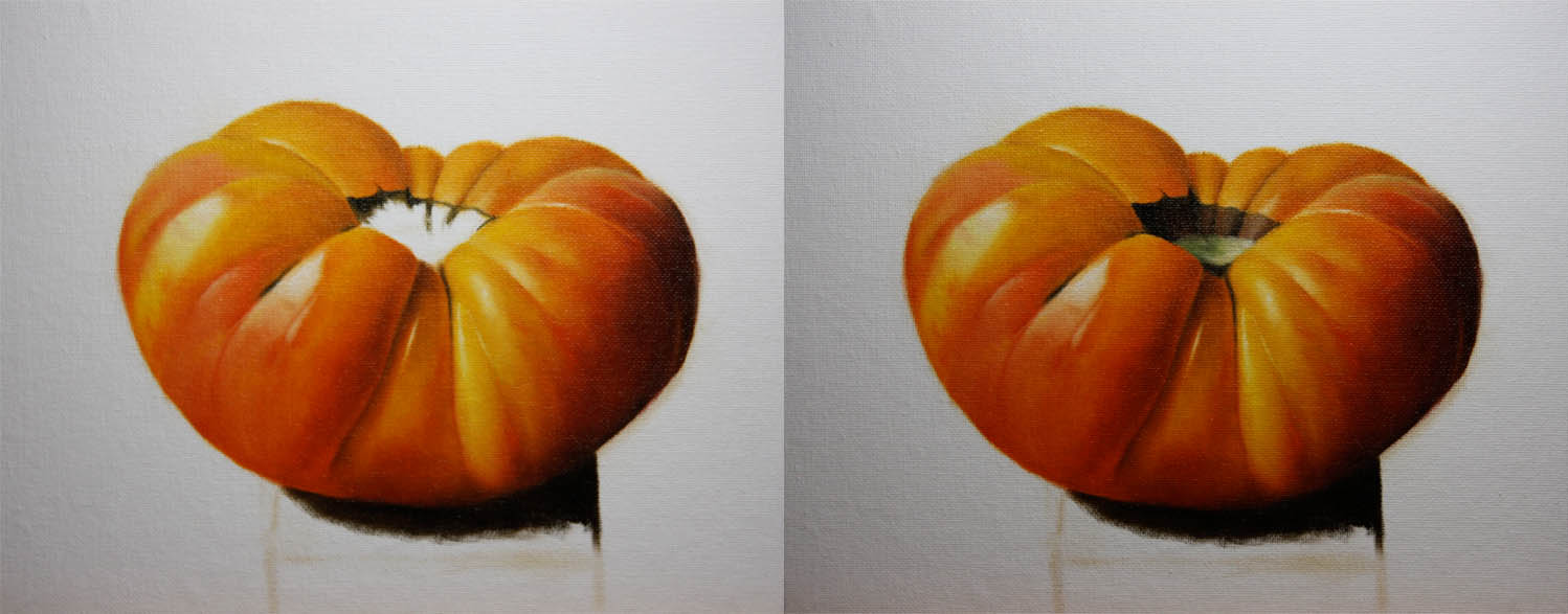
Tuesday, August 31, 2010

"Guava Pastries"

Sold
"Pasteles de Guayaba"
8 x 10 in
Oil on Canvas Panel
This is my first painting into pastries, this has to be my most favorite pastries to eat.  I love everything about them I can literally eat 20 of these a day, which is a good thing I don't.  They're called guava pastries or "pasteles de guayaba" in spanish, one of the main reasons why I miss Miami is because of these guys.  This painting is paying homage to these amazing treats, and yes I enjoyed eating every bit of them when I was done painting them!
I started with the traditional approach I do of using no mediums and a bit of raw umber for the draw in stage.  Then I concentrate on adding the local color and making the bigger forms turn even in the shadows.  I used deep cadmium red, cadmium yellow light, yellow ochre pale, burnt sienna, ultramarine blue and very little ivory black.  I tried straying away from using ivory black with the shadows, I liked the results so far although when I painted the base for the cast shadow I primarily used ivory black ooooops! ;)
After establishing the local colors and having the form turning I then added smaller forms or the details.  This was a very tricky area to paint you have to paint textures and be very abstract with your strokes, it turned out to be a lot of fun to paint.  It can get tricky though if you put a hard edge in any of the areas in there it'll be too obvious, you have to be aware of the form and how the values correspond to each other.  Then I moved onto the lighter values and the jelly hmmmmm yummy! You can see I'm just applying the local color and getting the feel of the overall form, not concentrating on details.  I'm applying thin paints in this area so I can build on top of it and also have it be controlled.
Then I added the smaller forms I used titanium white, yellow ochre pale, cadmium yellow light, cadmium deep red, cadmium red, cadmium orange, and burnt sienna.  You can see the smaller forms work better when the bigger form is established and the light is correct.  Then I started on the second pastry approaching it the same way as I did with the first, adding the local colors and worrying about modeling the bigger forms.
Instead of adding the smaller forms to the darker values and taking it to a finish, I decided to change it up and do the same with the lights and have an overall bigger form established.  I really liked doing this approach I was able to judge the lightest lights to the darks while establishing the smaller forms.
Then I added the smaller forms to the lighter values.  Then I approached the plate the same way just paint the fall of light and not worry about details.  Paint the simple information which is whats the local colors, where's the light hitting it, and make the form turn.  Once thats established you can add the smaller forms and mold it to fit with the bigger forms, remember if the bigger form is not right then the smaller ones will never be right.  You must always make the smaller forms work with the bigger forms in respect to chroma, fall of light, and hue.
Then I added the smaller forms to the plate I used titanium white, cobalt blue, and ivory black.  Then I also added the background which was ivory black, yellow ochre, burnt sienna, and cadmium orange.  The last pic is the final result, it was nice painting these delicious treats I hope you enjoyed this one as much as I did!  Thanks for stopping buy and viewing.  Bon appetite!  


Sunday, August 29, 2010

"Plum"

Sold
"Plum"
5 x 7 in
Oil on Canvas Panel
I have been away for about a week and half on vacation and it feels so good getting back to painting.  I visited my family in Miami and brought all my painting supplies but for some reason could not get to it, I guess it wasn't the right time to paint.  I decided to paint this plum to get back to painting on my regular routine, I really don't like not painting for that long.  When I was in Miami my mother always had plums laying around to eat and I really love these fruits.  
I started with the usual dry brush approach using raw umber  and no medium, after the drawing was established I started on the darkest values of the plum.  I used ivory black, and cadmium red light, I first made sure the big form was turning. 
Then I added the local colors on the inside of the plum, I used cadmium red light, cadmium yellow light, burnt sienna.  After the big form is turning I added the smaller forms or the details and made sure they work well with the larger form.  Then I added the base and background colors using burnt sienna, ivory black, cadmium yellow light, cerulean blue, and titanium white.  I also added the background when I was done with the base using cerulean blue, titanium white and some cadmium red light.
This is the finished painting sorry to have missed some steps with the process photos, a little rusty I've been out of it for a while ;)  Thanks for stopping by and viewing, hope you enjoyed this one!

Friday, August 20, 2010

"Heirloom Tomato no.3"

Sold
"Heirloom Tomato no.3"
8 x 10 in
Oil on Canvas Panel
Hi everyone well today was pretty crazy in the middle of painting these studies and teaching I'm glad I was able to paint this heirloom tomato.  This is the third time painting these guys and I gotta tell you that I really enjoy them.  In the beginning I wasn't thrilled due to the challenges they impose but once I moved passed that it became more educational.  That's one of the things I love about these studies you learn something new with each one or rediscover what you knew before and apply in a whole new way.
I started with the usual dry brush approach using no mediums just a bit of raw umber on the brush for the drawing stage.  After the drawing is done I started on the darkest values section using ivory black, cadmium red light, cadmium deep red, cadmium orange, cadmium yellow pale.  At this point I'm just concentrating on big form modeling, I'm not concerned with the details they come when the bigger forms are situated just right.
After the big form is turning I start adding some hints of the indents or middle values.  When adding this step I'm constantly aware of the value shifts from dark to lighter values,  making sure it's working with the big form and turning correctly.  I'm not adding lighter values until the middle ones are working right, then I add the lighter values using titanium white and cadmium yellow light.
Then I move onto the next section after the first one is completed, I apply the same approach as I did with the first section.  I'm also using the same palette, just different variations depending on the area.
The left side of the tomato was a little challenging to make the big form turn and make it subtle.  I didn't use any ivory black just for the little crease in the middle, one has to be very sensitive in seeing shifts of values and hues.
Then I added the pit of the tomato using ivory black, burnt sienna, titanium white, viridian, cadmium yellow light.
Then I started on the wooden base using ivory black, burnt sienna, and cadmium orange.  Then for the lighter values I used the same mixture just added some titanium white.
Then for the background I used cerulean blue, cadmium red, cadmium orange, and titanium white.  This painting was delightful to create, the subtle colors from one area to the next was a challenge for sure but I learned so much.  Every painting has challenges they posses its up to us artist to unlock those barriers and learn as much as we can from them, that to me makes it worth wild to keep creating these alla prima studies.  To constantly push myself in developing my technique and achieving the best quality I can, not settling for anything less.  Thanks for stopping by and viewing my work, hope you enjoyed this one!

Wednesday, August 18, 2010

"Lemons"

Sold
"Lemons"
5 x 7 in
Oil on Canvas Panel
It's been a while since I've painted lemons, I'm attracted to their textures and subtle colors.  The composition was fun to create as well, having both lemons appear as if they're teetering on the edge of the wood was challenging.  As expressed before textures are an attractive element to paint, they give these lemons so much character with such little force.
I started with the usual dry brush approach using no mediums and just a bit of raw umber on the brush.  After the drawing was established I started on the first lemon working on darker values, I used ivory black, cadmium red deep, cadmium orange, cadmium yellow light.  As stated in previous post I concentrate on each section and try to take it to a close finish, I have to put in lighter values in other areas in order to make the form turn and judge the total finish of that section.
Then I put in the lighter values using cadmium yellow light, titanium white, and viridian.  I'm constantly going back and forth from darker to lighter values, shifting chroma and hue in order for the form to turn and bring it to a finish.  Then I start on the second lemon doing the same approach as I did with the first and also using the same color mixtures.
These pictures show how I like to approach the lighter values of the lemon according to modeling the big form and smaller forms after.  The first picture shows the general lay in of chroma and hue, making sure the big form is turning and looks believable.  After the big form is turning I start ( As you can see on the second picture) to add the smaller forms or the details that lay in and work with the bigger form.  In order for these smaller forms to work the bigger form has to be right, when adding smaller forms I'm constantly aware of not loosing the turn of the form and the way the light's hitting it.  When one understands this concept of rendering forms it then makes it much easier to look at shapes and paint them.
I started on the base after the lemons were taking to a finish, using the same approach with the lemons starting on the darker values first.  I used ivory black, burnt sienna, and cadmium orange.  Then I added the lighter values using burnt sienna, cerulean blue, cadmium orange, and titanium white.
I added the background when the base was finished, I used a bit of cerulean blue, naples yellow, cadmium yellow light, and titanium white.  When painting these lemons I started to notice how important it is to understand how light effects the subject you'r painting.  It's a simple thing I learned when I was at the atelier in Florence and always am aware of it, but after this painting I can see that its something simple but very important to remember. My suggestion to anybody learning to draw and paint understand big and small form modeling, its crucial to understand how light affects an object.  Thanks for viewing my work and hope you enjoyed!  

Tuesday, August 17, 2010

"Garlics"

Sold
"Garlics"
8 x 10 in
Oil on Canvas Panel
Garlic is always used by my girlfriend to cook so many delicious meals, there are always laying around the kitchen ready to be used.  The smell of it while it's being cooked is so good, I had to do another painting of these guys to pay homage to them.  I wanted to portray them having some character not just sitting on top of a wooden board doing nothing, hopefully I did so with this painting.
I started with a dry brush approach as usual using no mediums just a bit of raw umber on the brush to get the drawing correct.  After the drawing is established I start on the first garlic going from darkest to lighter values, I used ivory black, titanium white, burnt sienna, and cadmium orange.
I spend all my time in one area getting the value, chroma, drawing and edges right, after all that is correct I move onto the next section.  I started on the second garlic doing the same procedure as I did on the first, I'm also stating the darkest values in the cast shadow to introduce some of the wooden base.
On the third garlic I did the same procedure as the first and second one.  I tried to keep the strokes in the lighter areas more loose and have character to them, I did soften some of the strokes to give a good balance of loose and tight areas.
Then I added the darkest values to the base using ivory black, cadmium orange, cadmium red light.  I also used burnt sienna, cobalt blue, and ivory black for the cast shadows on top of the base.  Then I used titanium white, burnt sienna, cadmium orange, cerulean blue on the lighter values of the base.
I then used cerulean blue, naples yellow, and titanium white for the background.  This painting was fun to do a little challenging to implement character to a piece of food but overall fun, thanks for stopping by and viewing my work hope you enjoyed!

Monday, August 16, 2010

"Quick Flower Painting"

Contact me on information for purchasing this painting
"Alla Prima Flower"
6 x 10 in
Oil on Gessoed Board 
This is a painting I did today in an hour and half at a rose garden near my apartment, the weather is getting much nicer here and its bearable to stay outside without sweating too bad.  I took the weekend off from painting and glad to be back today painting, doing a loose painting like this is different for me but I really love it so far.  It reminds me of doing gesture drawings capturing the essence of the pose and getting it down as quick as you can, these can be warm up painting sketches before getting into the more detailed paintings.  There is still something though that I like from this style of painting, I've noticed I really like doing detailed paintings but too much of it can dull a painting.  Again this is just an experiment to see how I can improve and further develop my technique, thanks for stopping by and viewing.  
Detail
Painting the flower at the rose garden, the weather was so nice and my right arm got nicely burned!  I always forget to put sunscreen when I paint outdoors.
Smelling the flower!

Thursday, August 12, 2010

"Heirloom Tomato"

Sold
"Heirloom Tomato"
8 x 10 in
Oil on Canvas Panel
This is a painting that a client ordered from me it has two other paintings that go along with it but for now I'll just show this one, I'll show the other one soon.  This is actually the third time I've painted this tomato and every time I always find new challenges and ways to paint them.
I started with the usual dry brush approach using no mediums just a bit of raw umber on the brush, then I stated the background first using cerulean blue, naples yellow, and titanium white.
Then I added the base starting from the darkest values then moving towards the lighter areas of the base, I used ivory black, cadmium orange, cadmium red light, burnt sienna, cerulean blue, and titanium white.
Then I started with the pit of the tomato using viridian, cadmium yellow light, cobalt blue, ivory black, and naples yellow.  Then I started on the darkest values of the tomato using ivory black, permanent rose, cadmium red, cadmium red light, cadmium orange, and cadmium yellow light.  You can see I'm going from darker values to lighter ones slowly moving towards the lights in each area.
Then I concentrate on the middle values that are usually the yellows in this painting using cadmium yellow light, viridian, cadmium orange, and titanium white.  You can see that I'm concentrating on each section and taking it to the closest finish I can before moving onto the next section, the reason I say closest is because when you add other sections it can change the chroma and value of the one you just painted that's why its good to leave some room to change if need be.
This is the finished picture again as stated before these tomato's are fun too paint and challenging each time but a great learning experience.  Thanks for stopping by and viewing hope you enjoyed!

Monday, August 9, 2010

"Sun Jewel Melon"

"Sun Jewel Melon"
5 x 7 in
Oil on Canvas Panel
This melon is pretty unusual the green stripes going along the yellow body makes it appealing to paint, the rough texture outside combined with the smoothness on the inside is a perfect ingredient to paint.
I started with a dry brush approach using raw umber and no mediums, then I decided after the drawing was done to change the procedure and start with the background first.  I used cerulean blue, naples yellow, and titanium white for the background, I decided to go background first to change it up and see if the process can go faster.
Then I started with the base using burnt sienna, ivory black, cadmium orange, cadmium red light, then for the middle and lighter values I used burnt sienna, cerulean blue, and titanium white.  I'm constantly going back and forth from darker to lighter values adjusting them to work well with each other.
Then I started with the first going from darker values to the lighter ones using yellow ochre pale, cadmium yellow light, titanium white, cadmium orange, and cobalt blue.  You can see with the second pic how I start with the melons going from the slice darker value side and then moving towards the lighter side, again as stated before I'm going back and forth adjusting the values and chroma's.
I'm doing the same process with the other two slices.
This is the finished picture I enjoyed the fluidity and change of procedure I made with this painting, going from background to foreground is not a new thing too me but applying it to these studies is a new area for me.  Experimenting with new techniques and procedures is fun to do especially when painting everyday, thanks for stopping by and viewing I hope you enjoyed!

Friday, August 6, 2010

"Grapes & Cork"

Sold
"Grapes and Cork"
8 x 10 in
Oil on Canvas Panel
I really had the itch to paint grapes its been a long time since I've painted them and when I started I remembered why I took a break from them!  I do love painting the deep reds and blacks that are hidden within the skin of the grapes, I also wanted to add the cork to pay homage to the fantastic wines these guys produce.  Thursdays are usually a very busy day for me with teaching I really did not expect to do such an intricate painting, I usually like doing a 5 x 7 painting but today I pushed myself to the limit with this one!
I started with an intricate drawing I could not just generalize shapes I had to really concentrate and get everything to fit within the frame of 8 x 10 inches, I used the usual dry brush approach with no mediums just a bit of raw umber.  After the drawing was established I started with the first grape starting from the darkest values and moving towards the lights, I did this throughout the whole grapes in each section you will notice I take each section to a finish going from dark to light.  I used ivory black, cadmium red light, cadmium orange, cobalt blue and titanium white for the darks and lights.
I then started to put the cork in after I had something going for the grapes to bounce of chroma, and value, I used yellow ochre pale, ivory black, and titanium white for  the darkest to the lightest values.
Then I added the details after the overall chroma and values where established remember start from the largest information and if it reads well then you can go in with the details but it has to work with the larger information.  After the cork I started with the lighter grapes again using the same mixture and also going from darkest to lightest, I cannot stress enough how important it is to take each section you work on to a finish this allows you to dedicate all your concentration in one area.
Then I added the stems using cobalt blue, cadmium yellow, ivory black, and titanium white it was fun playing around with little stems going in and out of the grapes they added more character to the story I was trying to tell.  I then added the darkest value of the base using ivory black, cadmium orange, and cadmium red light.
Then I added the middle and lighter values of the base using burnt sienna, cobalt blue, ivory black, and titanium white at this point I can see the painting starting to come together.  Then I added the background color which is naples yellow, cerulean blue, and titanium white at this stage I had to be careful because of the intricate negative shapes that the grapes and stems had. 
 
Overall this was a very challenging painting to complete for a daily painting but glad I did so I learned a lot from it, I appreciate everyone stopping by and viewing my painting hope you enjoyed it!